Frontendly.io is an online learning platform built to boost the e-learning experience for frontend developers.
Five years ago, I created an open-source CSS selectors cheatsheet that unexpectedly grew to over 2,000 subscribers. This organic growth sparked our belief that I had discovered something valuable that could evolve into something much bigger.

That early success became the foundation for Frontendly.io. We planned to launch with the CSS Selectors course first, followed by a series of additional courses including CSSpresso, FE Bootcamp (focused on portfolio building) and other specialised frontend skills.

To support this growth and ensure consistency across all our educational content, we developed a robust design system that now serves as the backbone of our platform’s user experience.

Frontend developers who want to level up through hands-on, project-based learning that builds skills and career confidence.
To create pivotal moments of clarity and confidence for self-taught developers navigating their learning journey.
We built Frontendly.io around three core principles:
We measure impact through meaningful indicators tied to real learner outcomes:
User research: To gain a deep understanding of our learning community, I analysed feedback from over 2,000 CSS Selectors email subscribers, reviewed insights from past courses, and actively participated in discussions within the Daily.dev developer community.

This process involved two key steps:

Based on our risk assessment, we identified key design decisions to address our top-priority assumptions.
I began by identifying users’ top tasks and goals. From there, I grouped related content based on user expectations — not what I wanted to show — and defined clear paths for ‘global’, ‘public’, and ‘members-only’.
This task-driven approach helped shape an intuitive, goal-oriented information architecture that reflects how real users navigate and learn.

Based on the information architecture and research, I first collaborated with the team to sketch hand-drawn wireframes. This helped us quickly align on layout ideas and content priorities. Once aligned, I translated the sketches into low-fidelity prototypes in Figma to explore structure, hierarchy, and user flow more clearly.


Based on our information architecture, I established a development priority flow — starting from global components to member-only features — which allowed us to build the design system alongside product development.
Component Categorisation Strategy:

Multiple Perspectives:
– A delightful user experience
– A scalable system foundation
I began by researching real-world UI components to validate practical design patterns. Based on these insights, I built the high-fidelity prototype and design system in parallel. As mentioned earlier, we had plans to expand the brand with additional courses — so scalability was essential from the start.
Let me walk you through the high-fidelity prototype process using the video content list as an example:

Research Scope
Analysed video course interfaces across 4 major e-learning platforms (edX, Deeplearning.ai, Udemy and Khan Academy) to identify design patterns and opportunities for Frontendly.io differentiation.
Key Findings
This research directly informed our search-driven learning approach, enabling developers to instantly access specific CSS selectors instead of following traditional linear course sequences.
Other UI research collection
This UI research covers key flows including navigation, sign-up, appearance settings, checkout, and pricing. It was used to inform design decisions through pattern comparison and benchmarking.

This is the outcome of the high-fidelity prototype and design system.


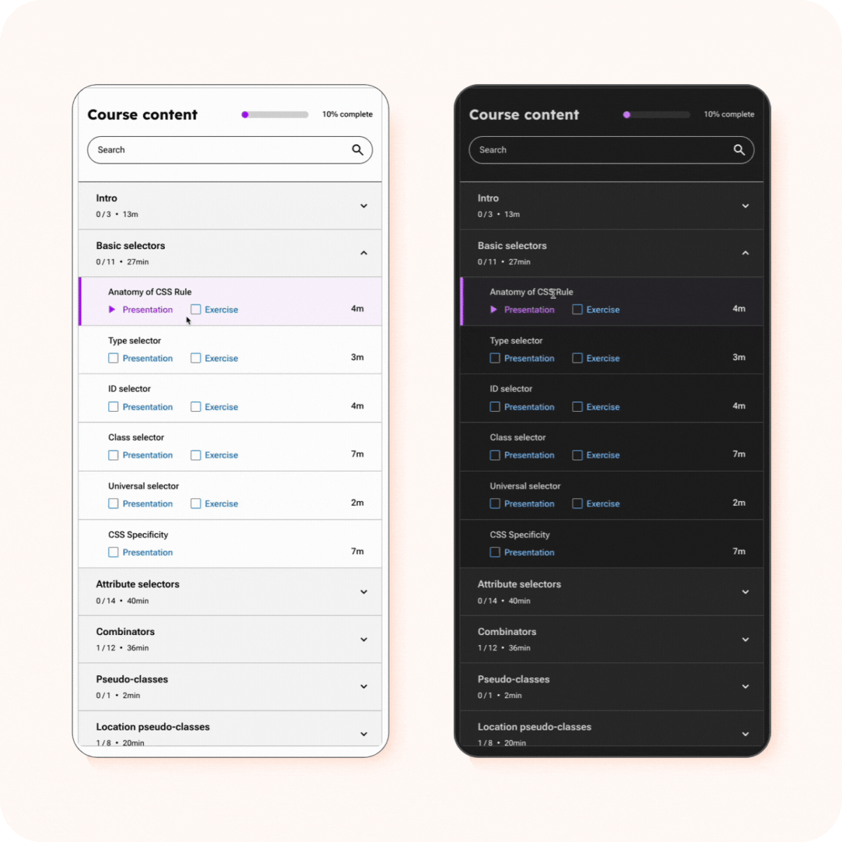
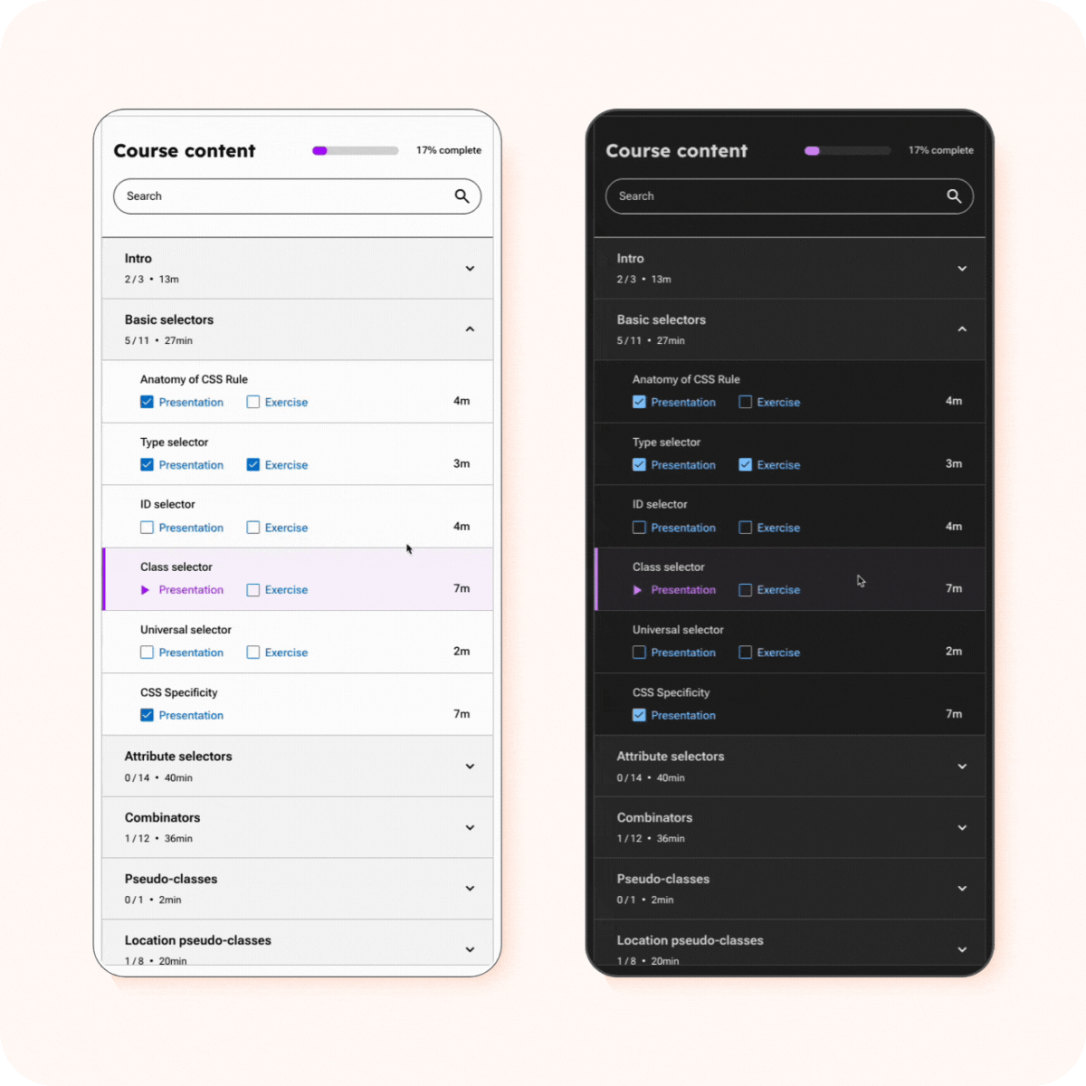
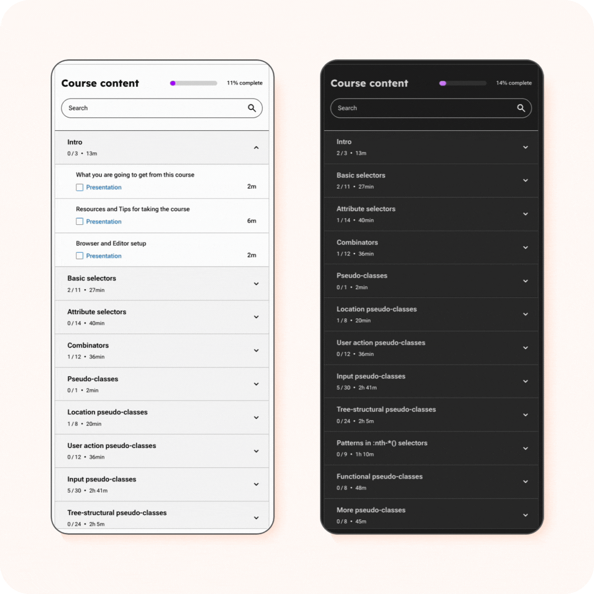
🎯 Search-driven video play list
Unlike traditional linear courses, ours is built around real developer needs. Developers can quickly search for what they want to accomplish and get targeted solutions without having to go through everything sequentially.


✅ Accessibility in mind
I carefully designed all UI elements to support accessibility across various states — active, hover, and focus — in both light and dark modes, ensuring usability for keyboard and screen reader users.
State: Active
State: Hover
State: Focus


📈 Course progress tracker UI
This video course list includes two levels of progress tracking:
These layered achievements motivate learners and encourage continued engagement throughout the course.

📱Mobile first design


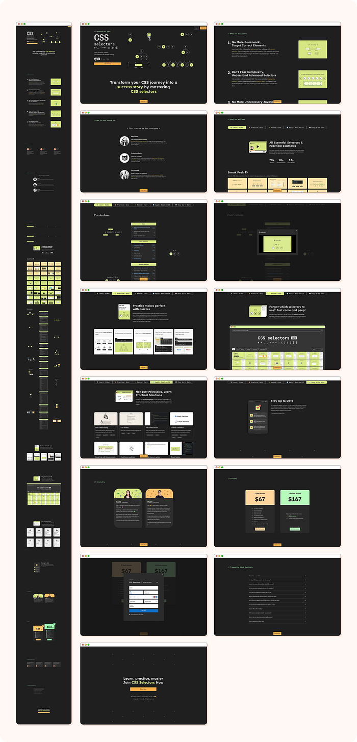
CSS selectors course sales page
I developed the design system in close collaboration with frontend engineer Ryan Yu, guided by these 5 core principles:

I documented my design system journey on UX Collective, exploring the challenges and breakthroughs of implementing Figma’s variables feature.
👉 Read the full article here: “Optimising your design system with Figma’s variables”

Final design system version 1 (2024)
The complete design system library and documentation created in Figma includes:


Starting Frontendly.io, I had no business background. I’ve since learned to connect design decisions to business goals, communicate value effectively, and think strategically to support user growth.
Next step: collaborate with talented people in marketing and sales to gain diverse perspectives and drive better outcomes.
We spent nearly 6 months building the Frontendly.io website and creating 70+ CSS selector videos without user feedback — a costly lesson in building before validating.
Now, we share early on social media, validate quickly, and build based on what resonates.
Lesson: Test fast. Learn faster.
After building dark/light mode, I want to empower users to personalise their experience — theme, spacing, font, and features — for better accessibility and comfort.
I’m evolving our system with expressive, human-centered micro-interactions to create more elegant, realistic, and emotionally engaging interfaces.
We’re now focused on building a meaningful community — sharing early, listening deeply, and growing alongside our learners.
Thank you for reading and I hope you like this case study and find it helpful for your future projects! 🧙🏻
💌 Any feedback or challenge
I’d love to hear your thoughts or say hello 👋 :
Connect with me on LinkedIn.