
This article was published on UX Collective on March 11, 2024
👋 Hello, codesigners.
I‘m happy to share how I utilised Figma’s variables to create tokens and variables for our design system.
Over the past year, the idea of developing a new design system, particularly leveraging CSS custom properties for implementing light and dark modes, had been on my mind.
Around that time, in June 2023, Figma released a new feature called Variables, which was super useful to create a design system.
Let’s dive into it!
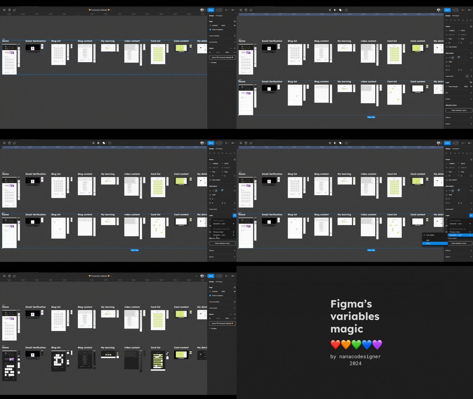
Table of contents
1. Keep in mind the 5 design system principles
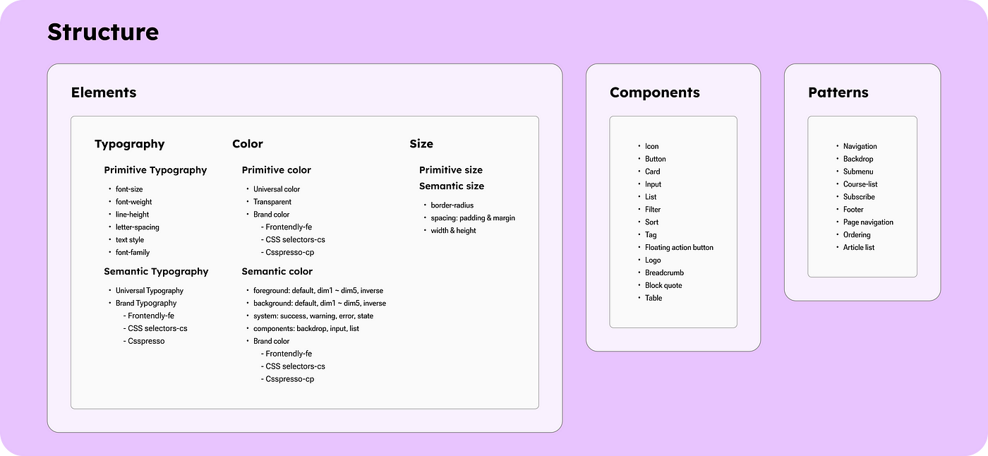
2. Anatomy of the Product
3. Primitive variables
4. Semantic variables
5. Wrap-up
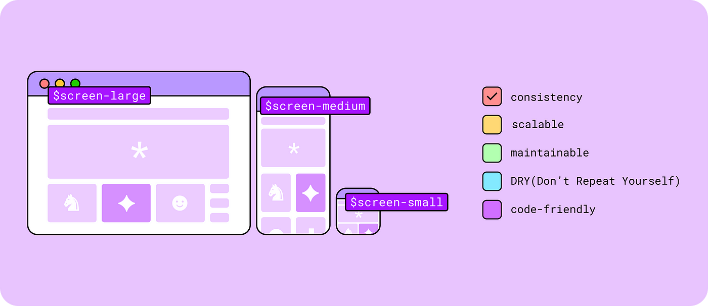
Whenever I needed to make a design decision for a design system, I constantly questioned whether my design approach was consistent, scalable, and maintainable and whether it minimized redundancy. I will provide further details below with practical examples.
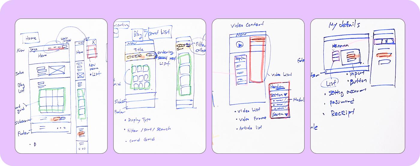
Handwritten Wireframe of the Product’s Anatomy
First, I should understand the product requirements, such as Information Architecture (IA), brand identity and which functionality the target audience needs, etc.
In this step, I asked some questions such as:
The decision for every question should always be made based on sufficient communication with engineers and project managers, ensuring that we are all moving forward together. The design system is not solely the domain of designers. I believe it should be renamed to something like a ‘codesign system’ to reflect its collaborative nature.
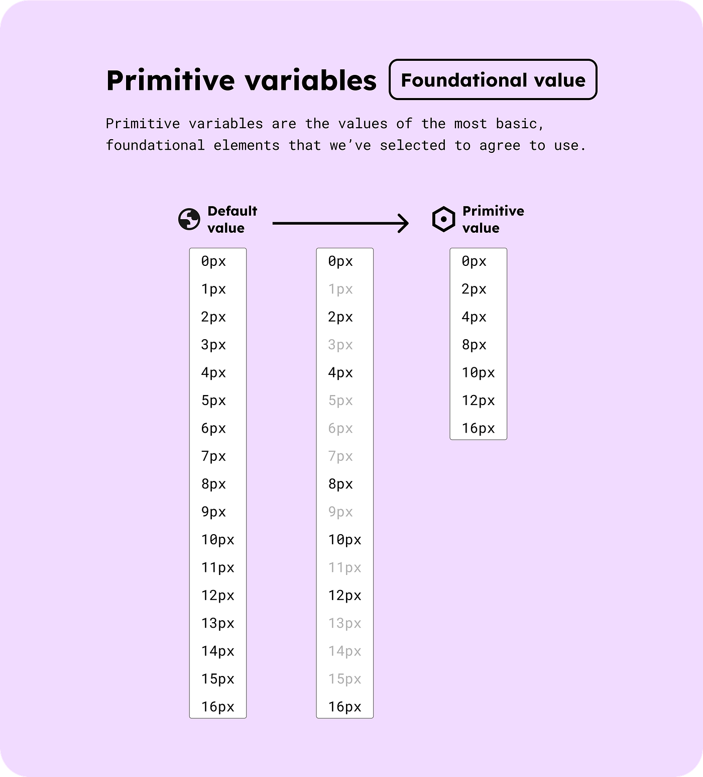
What are primitive variables?
Primitive variables are the values of the most basic, foundational elements that we’ve selected to agree to use.
Fast Design Decisions:
You can make design decisions within the selected values without considering all other values.
Best Practices for Engineering Performance
Any pixel sizes like 1px, 2px, or 3px can be used, but using multiples of 8 or 16 (e.g., 2px, 4px, 8px, 16px) is recommended for optimal performance.
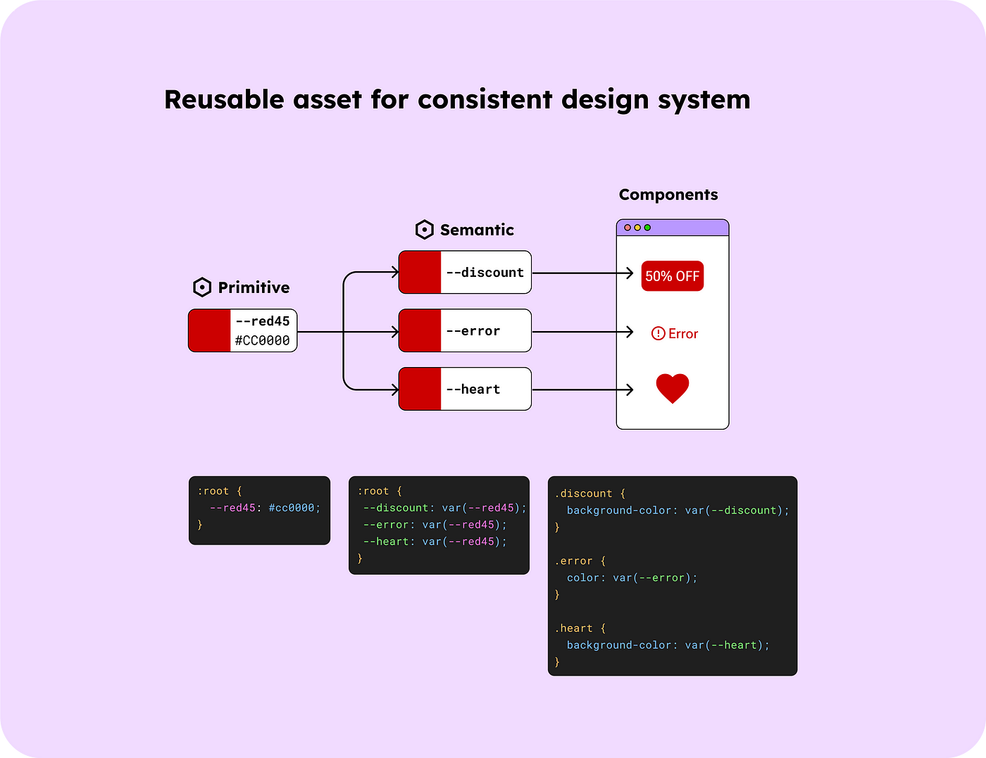
Reusable Asset for Consistent Design System
For instance, by setting Red45 (#CC0000) as a primitive value, it can be reusable as a warning sign colour, discount colour, or even for hearts, ensuring a consistent design system.
Naming tokens was the hardest part for me when building a design system. It should be flexible, adaptable, and scalable. Through this project, I found that numeric token names are maintainable. Let me explain in more detail.
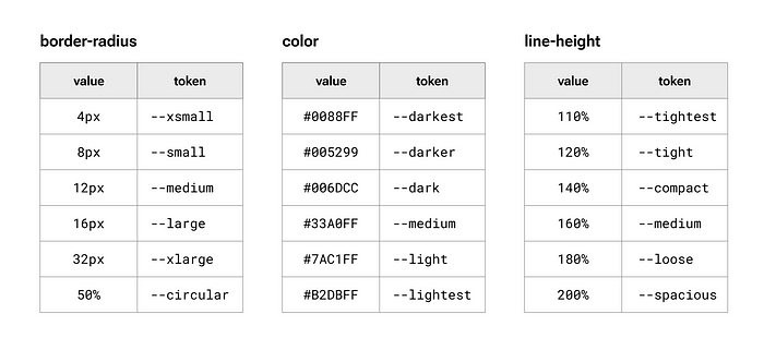
⚠️Bad examples: Not scaleable token names
You might be very familiar with the following token names
I found that these token names made it difficult to add new values later.
For example, if a 24px border-radius needs to be added, we must find an appropriate term that fits between ‘large’ and ‘xlarge,’ which can be a hassle.
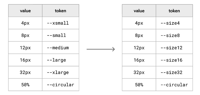
✅ Best practice for border-radius
I found it worked well with the border-radius token names to be numerical pixel values instead of abstract token names like those listed below the image.
✅ Best practice for colours
Most design systems utilise colour palettes in the following method: blue 100, blue 200, blue 300, and so on. However, I’ve always wondered if I need all those colours? What if I need a colour between blue 100 and blue 200?

So, I decided to define the colour token names using their lightness value. This approach allows me to store more accurate colours I want.
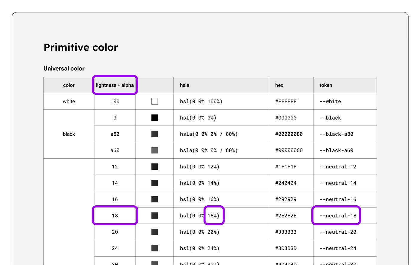
⚙️ Setting up primitive variables in a Codesign system
The below 3 screenshots are for setting up primitive variables within a design system document, Figma library and VS Code.
Size primitive variables

Colour primitive variables

Typography primitive variables

Figma does not yet support typography variables (at the time of writing this article — Feb 2024), but the hopeful news is that they are in the process of creating them.
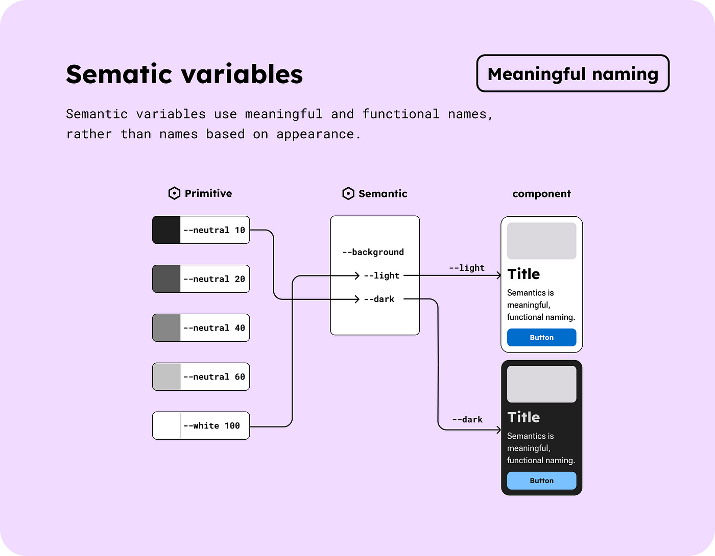
What are semantic variables?
Semantic variables use meaningful and functional names, rather than names based on appearance. This approach enables the creation of multiple modes (such as light/dark mode) through the aliasing of primitive variables. That means we don’t have to create multiple colour palettes for different light/dark modes. That’s amazing! We can also maintain a single source of truth.
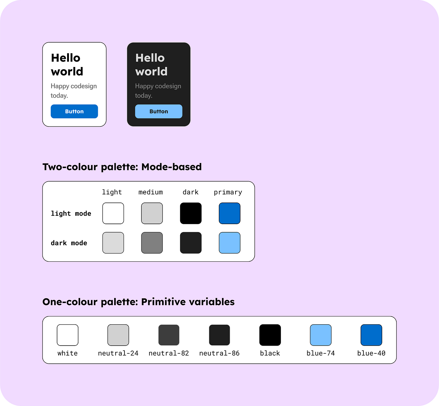
When defining colour-level token names for multiple modes, such as light and dark modes, the elements should have compatible token names that can be used across the modes.
Let me explain using the colour contrast level as an example.
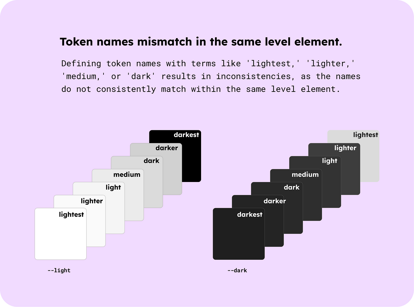
If we define the neutral levels for light mode with terms like lightest, lighter, light, etc., it becomes impossible to match the token names with dark mode, as illustrated in the above image.
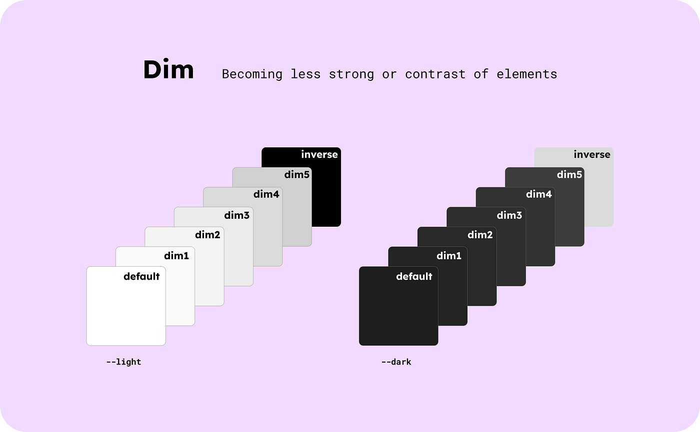
To enhance the process of defining meaningful token names, I researched other design systems and the terminology they use:
–elevation, –layer, –field, –background
However, these terms are predominantly associated with the background. I sought a term that could apply to the foreground and other colours as well. Therefore, I decided to use ‘Dim.’ It refers to a reduction in the strength or contrast of elements.
⚙️ Setting up semantic variables in a Codesign system
The below 3 screenshots are for setting up semantic variables within a design system document, Figma library and VS Code.
Colour semantic variables

Typography semantic variables


Exploring design systems from big companies like Material, Carbon, Atlassian, or Fluent can be overwhelming for solo designers or beginners. It’s hard to know where to start with many components, patterns and variants.
Building a design system is like stacking bricks. Start setting up primitive and semantic variables based on analyzing your project. And create the most necessary components first, before you know it, you’ll have a design system optimised for you. Then, your next project can start ahead, making it pick up speed much faster.
I hope you like this article and find it helpful for your future design system projects!
❤️🧡💚💙💜Happy codesign today 🧙🏻♀️❤️🧡💚💙💜
References for real-world design systems
References for understanding the development perspective
References for adopting Figma variables
💌 Any feedback or challenge
I’d love to hear your thoughts or any questions you might have.
Feel free to send me a message or say hello 👋 on Linkedin | Bluesky | X . I’m excited to connect with you!