👋 Hello Codesigners! I recently designed a website for Artist Kim Eull and wrote a case study. I want to share the CSS grid tips that I used in this project in this article.
Galaxy layout with CSS Grid
Table of contents
- • Inspiration
- • Specifications
- • Solution
- • CSS Grid tip
- • Sneak Peek CSS Grid cheatsheet
Inspiration


Galaxy is one of Kim Eull’s signature artworks, and it was installed with Kim Eull’s 1,450 drawings. When I saw this installation artwork, I wanted to bring it online as is. I thought it could be quite easy to re-create and visualize it using CSS Grid.

But it was more complicated than I expected making the Galaxy layout with 1,450 drawings 😅.
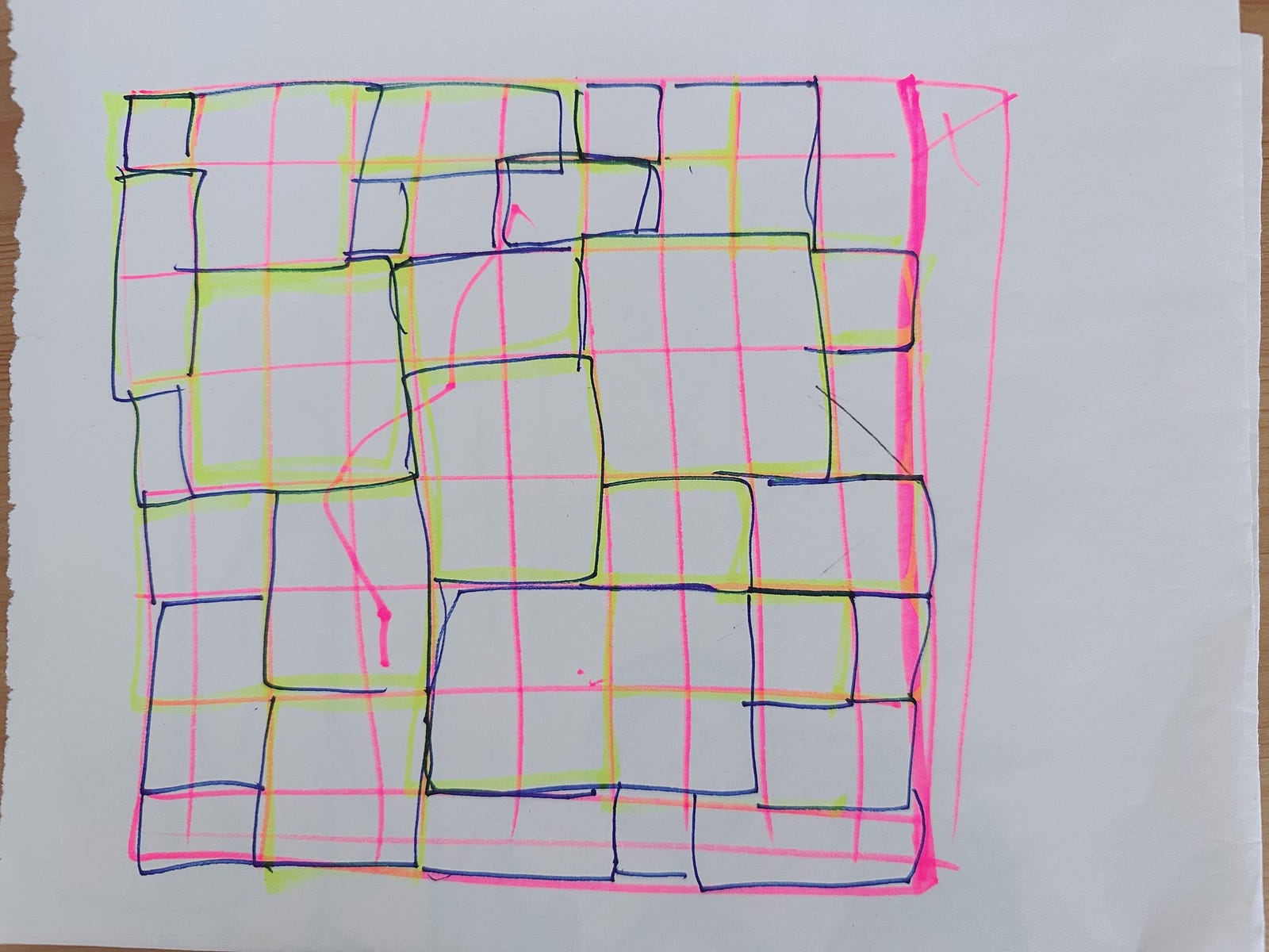
The above drawing was my first attempt to make the Galaxy layout. Based on that, I came up with further specifications for the Galaxy layout.
Specifications
- • The grid container should look like a Galaxy layout.
- • The grid container should look flexible across different browser sizes.
- • Each grid item has a hover effect and links to its content page.
- • Each grid item has fixed shapes, vertical rectangles, horizontal rectangles and squares following the ratio of • Kim Eull’s drawing. This is to follow the exact ratio of each original drawing.
- • Specified properties and values for each grid item in WordPress so the client can easily choose and upload artwork for each grid item if he wishes to change it.
Image configurations in WordPress
- • Image size: small, medium, large
- • Shape: vertical rectangle, horizontal rectangle, square
Solution
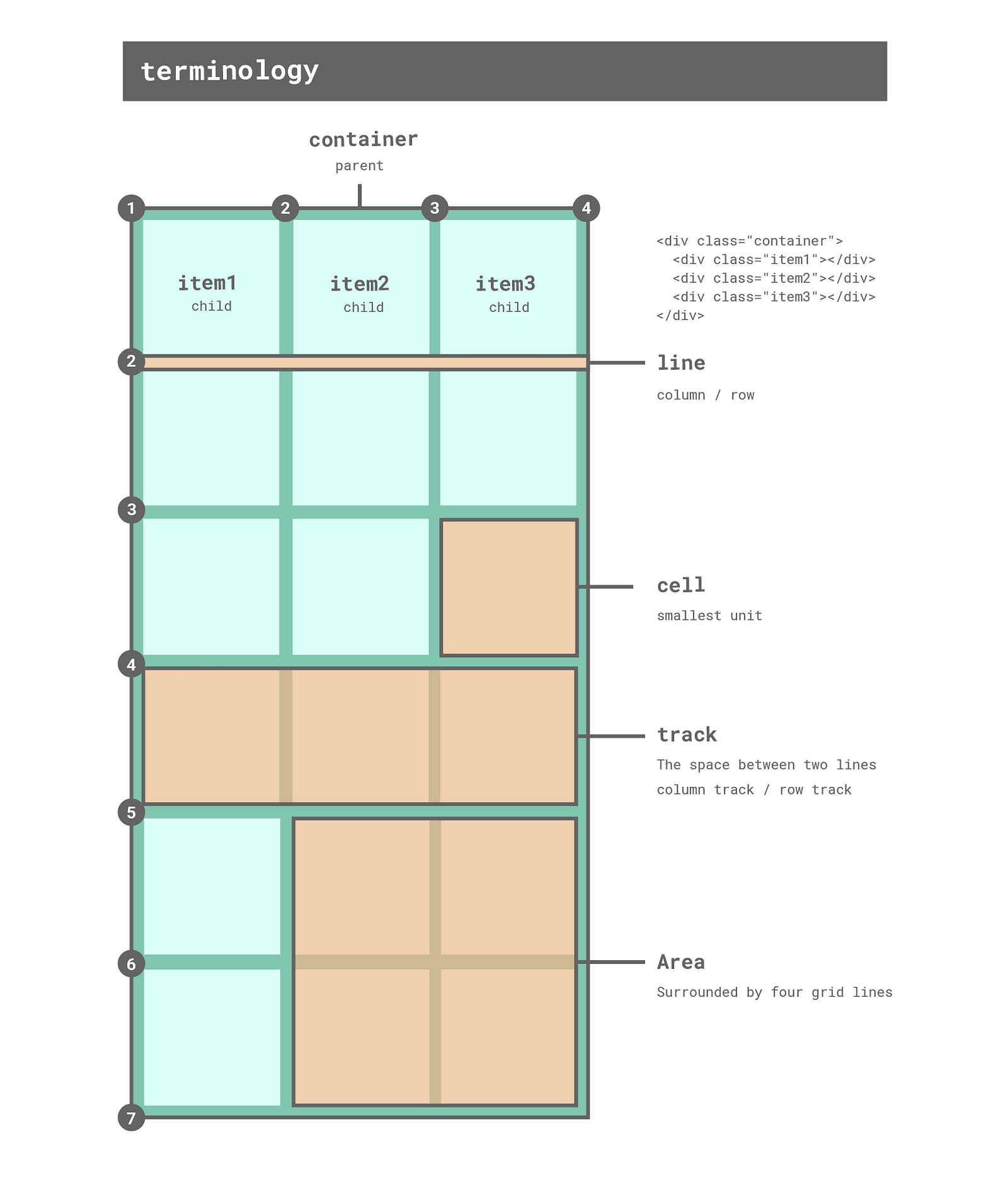
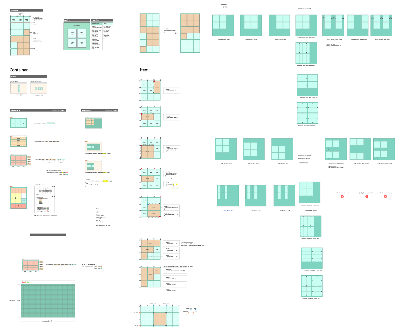
① Understand the CSS grid structure
CSS grid is like an IVAR storage system (IKEA) like the images below. We need to define a container (IVAR storage) and items (organising boxes) respectively.

Here is the CSS grid cheat sheet. I hope it helps you understand the CSS grid structure.
② Find suitable properties
As you can see from the CSS Grid cheatsheet below, CSS Grid has many properties and values as well as various features.
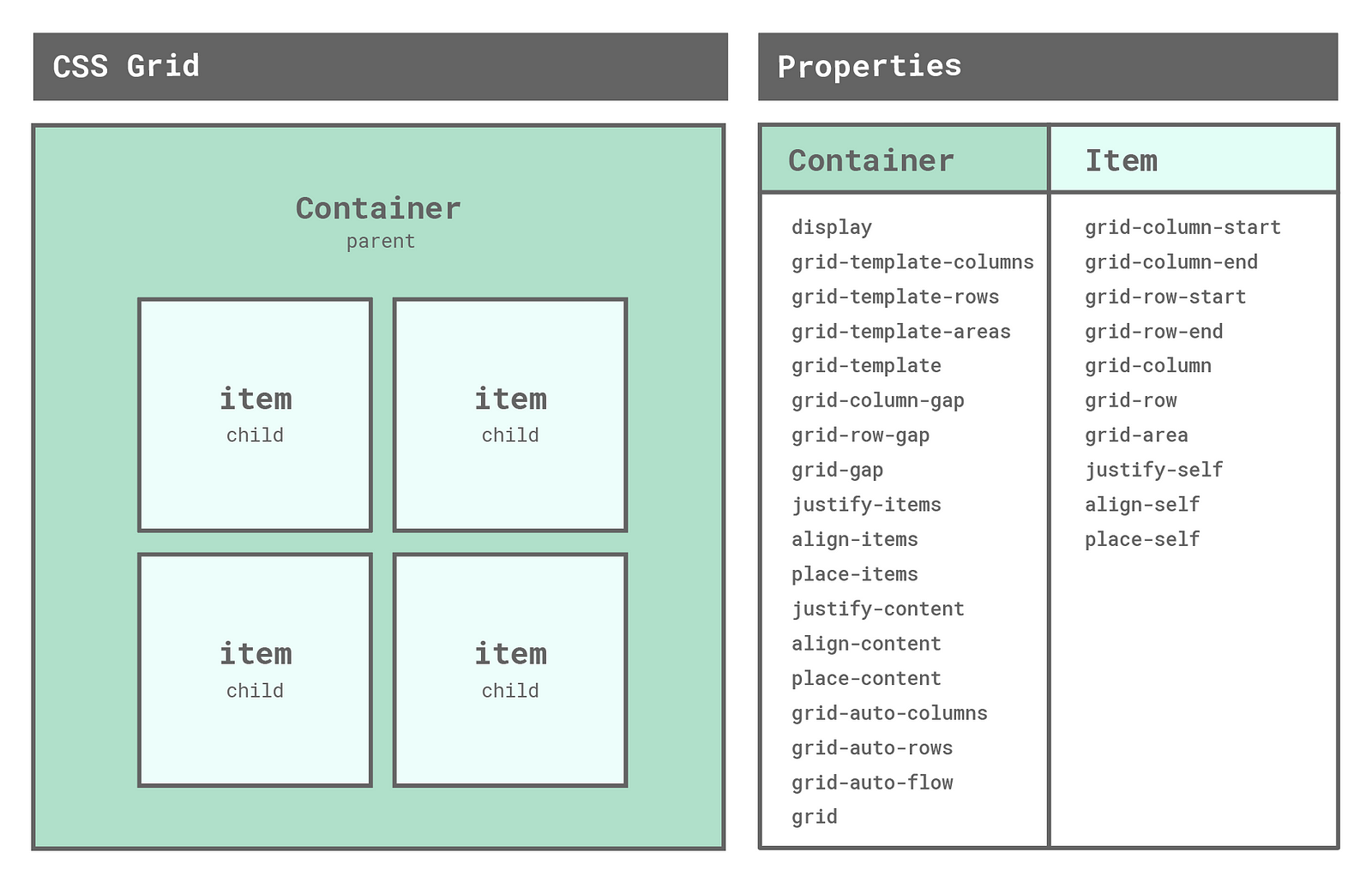
It was important to find suitable properties and values of CSS Grid for the Galaxy layout. I tried all properties and found grid-template containers and grid-area items worked best for the Galaxy layout.
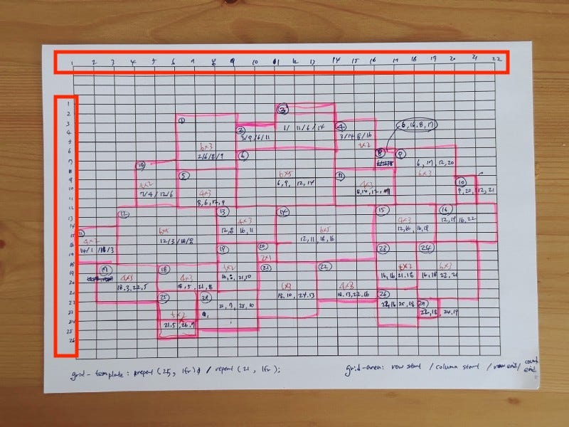
③ ✍🏻 Draw a galaxy layout on the grid
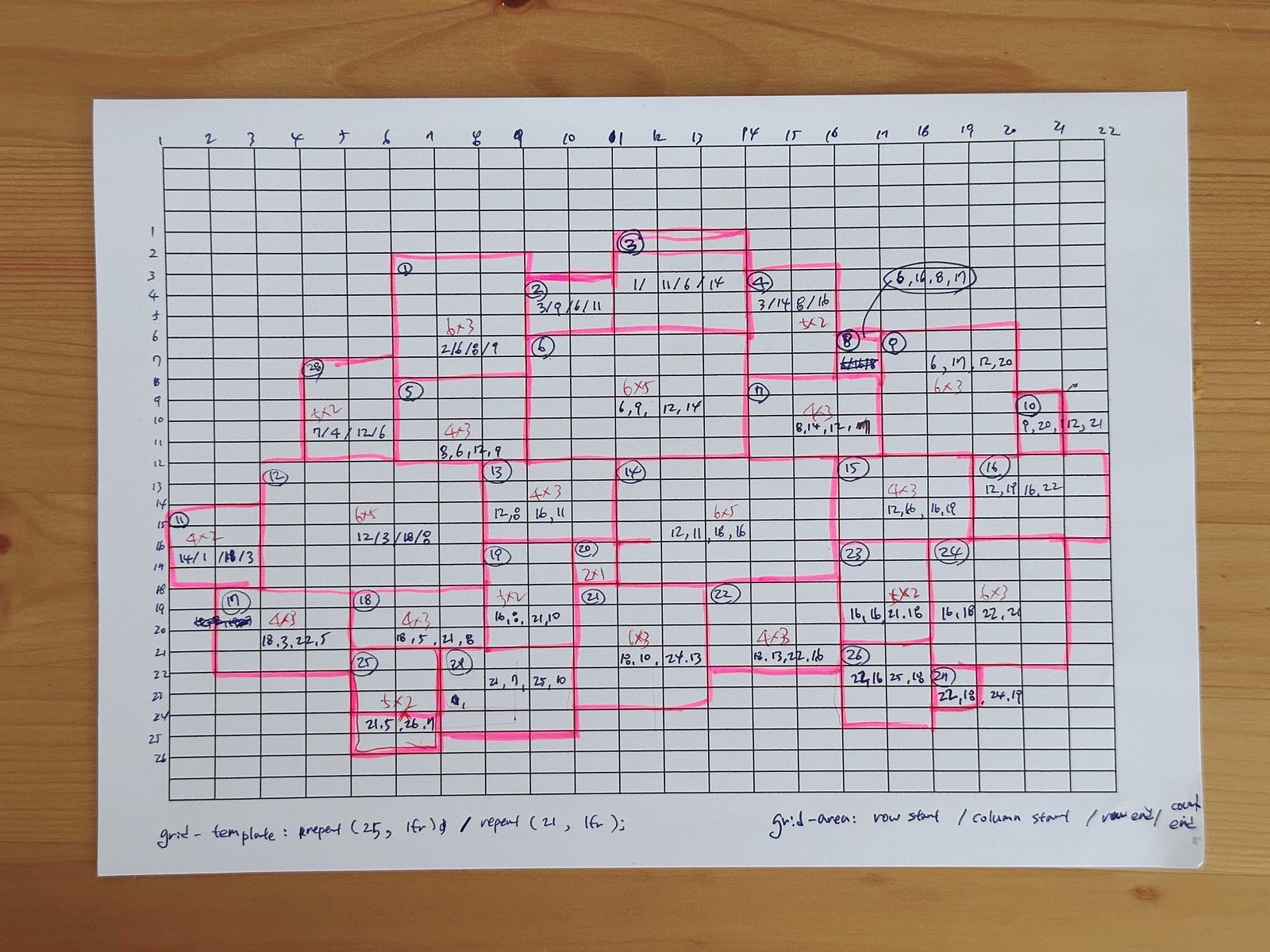
To get the values of grid-area for each item, I printed a grid pattern and draw a galaxy layout on it. (I feel more comfortable drawing my abstract thoughts by hand, maybe I am an analogue person 👵🏻.)
④ Numbering grid lines
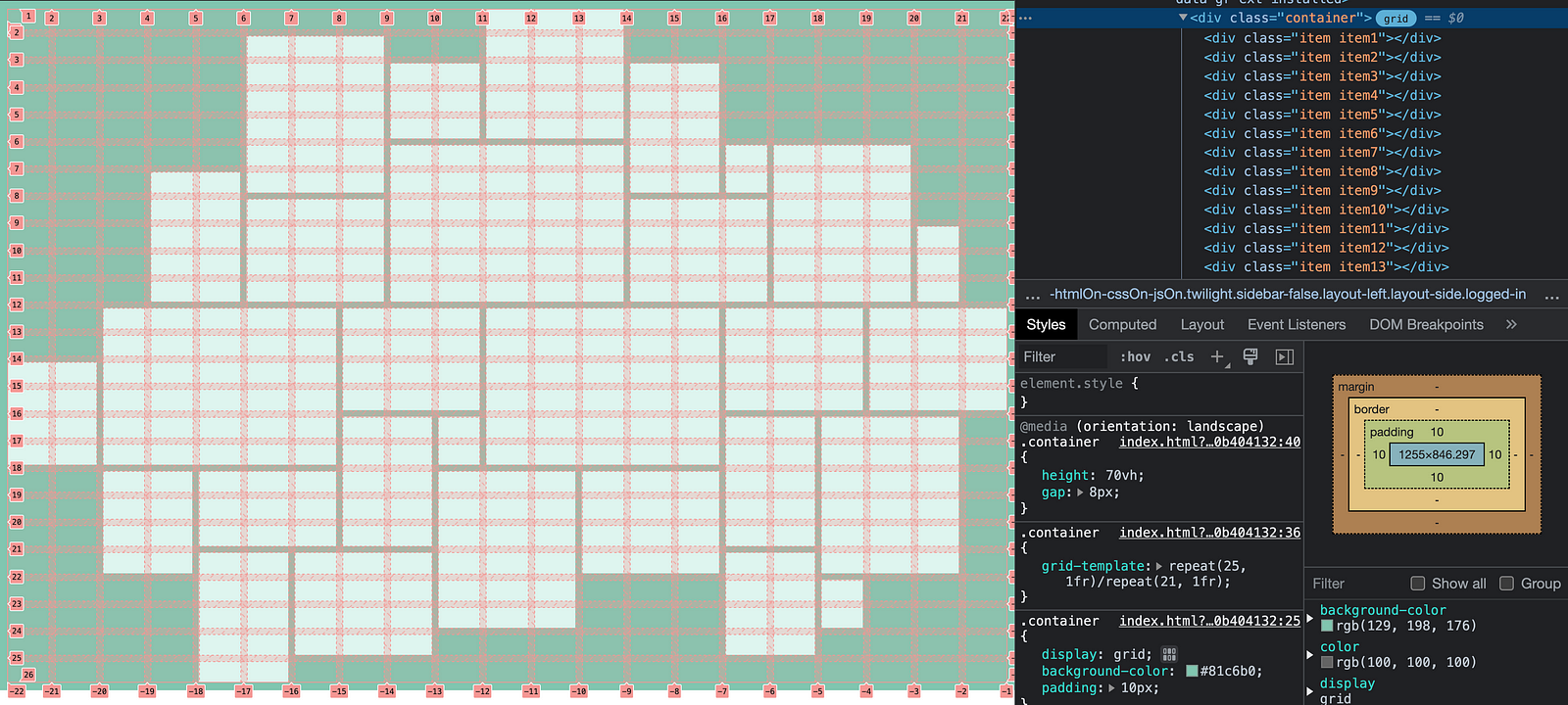
Put numbers into horizontal and vertical grid lines like the image below. This number will be used as a grid-area value later.
Also, we can inspect these numbers in the Chrome DevTools like below.
⑤ Set grid container
I used grid-template CSS shorthand property that is for defining grid columns, grid rows, and grid areas.
Here is the cheat sheet of grid-template.
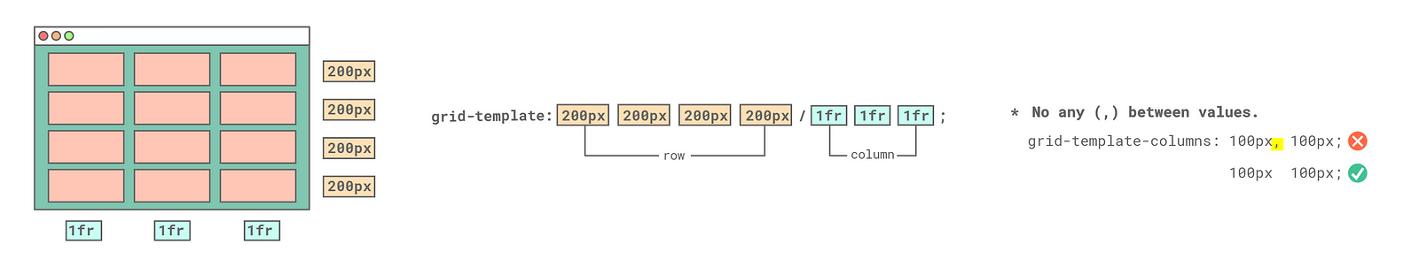
Here is the CSS code for the container. I used the repeat CSS function to create a certain number of columns and rows.
.container {
 display: grid;
 grid-template: repeat(25, 1fr) / repeat(21, 1fr);
}
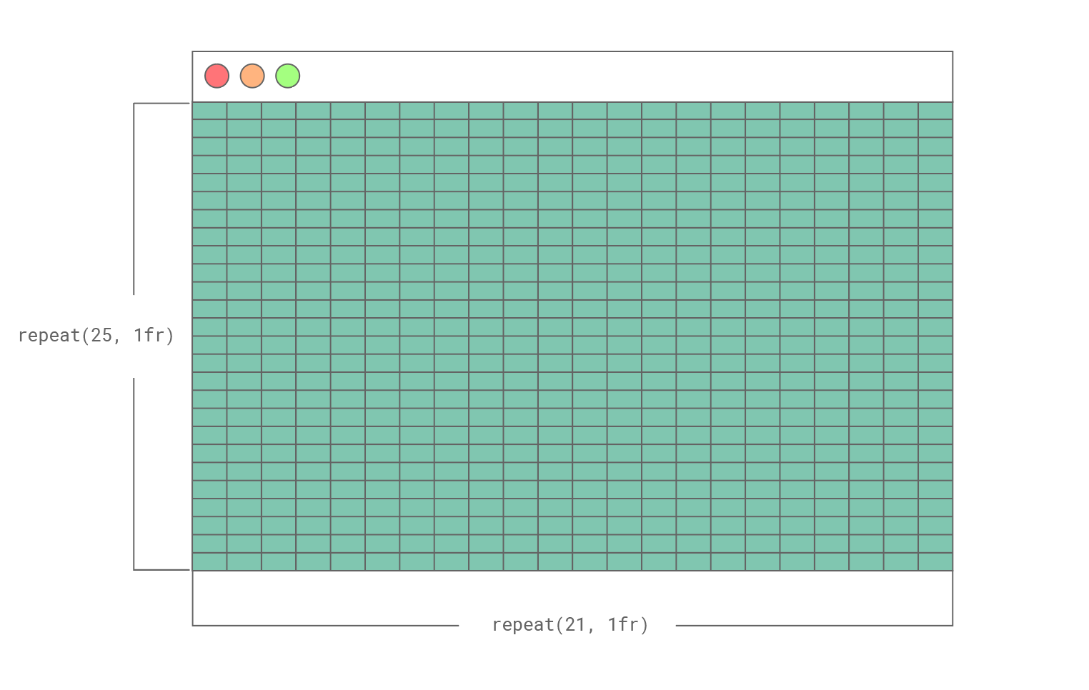
⑥ Set grid items
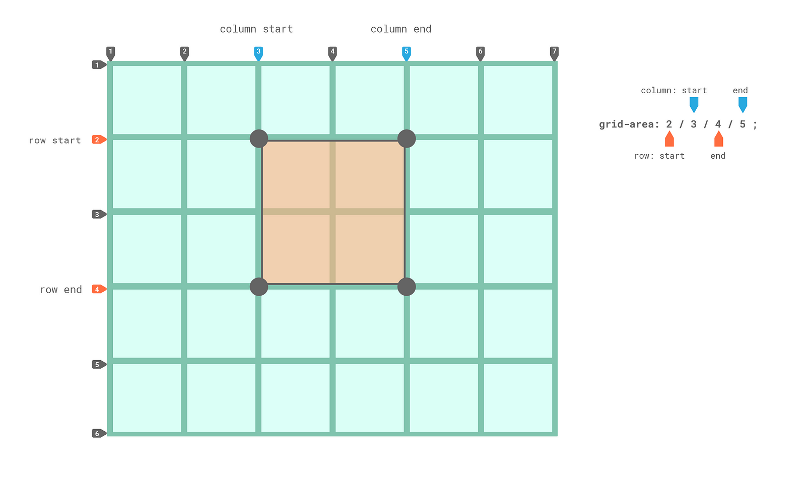
Now we have 525 grid cells. To specify the grid item’s size and location for the Galaxy layout, I defined grid-area shorthand property for 29 items.
Here is the cheat sheet of grid-area.
grid-area value: row-start / column-start / row-end / column-end
Here is the CSS code for the 29 items.
//item position

.item1 {
 grid-area: 2/6/8/9;
}

.item2 {
 grid-area: 3/9/6/11;
}

.item3 {
 grid-area:  1/11/6/14;
}

......


.item27 {
 grid-area: 22/18/24/19;
}

.item28 {
 grid-area: 7/4/12/6;
}

.item29 {
 grid-area: 21/7/25/10;
}
The
grid-areaCSS shorthand property specifies a grid item’s size and location within a grid by contributing a line, a span, or nothing (automatic) to its grid placement, thereby specifying the edges of its grid area. -MDN
⑦ Insert images in the HTML
This is the last step. I selected artwork images that fit in the proportion of each item (vertical rectangles, horizontal rectangles and squares) to prevent images cut off.
One day, I wish the CSS algorithm in the future could select suitable ratio images automatically.
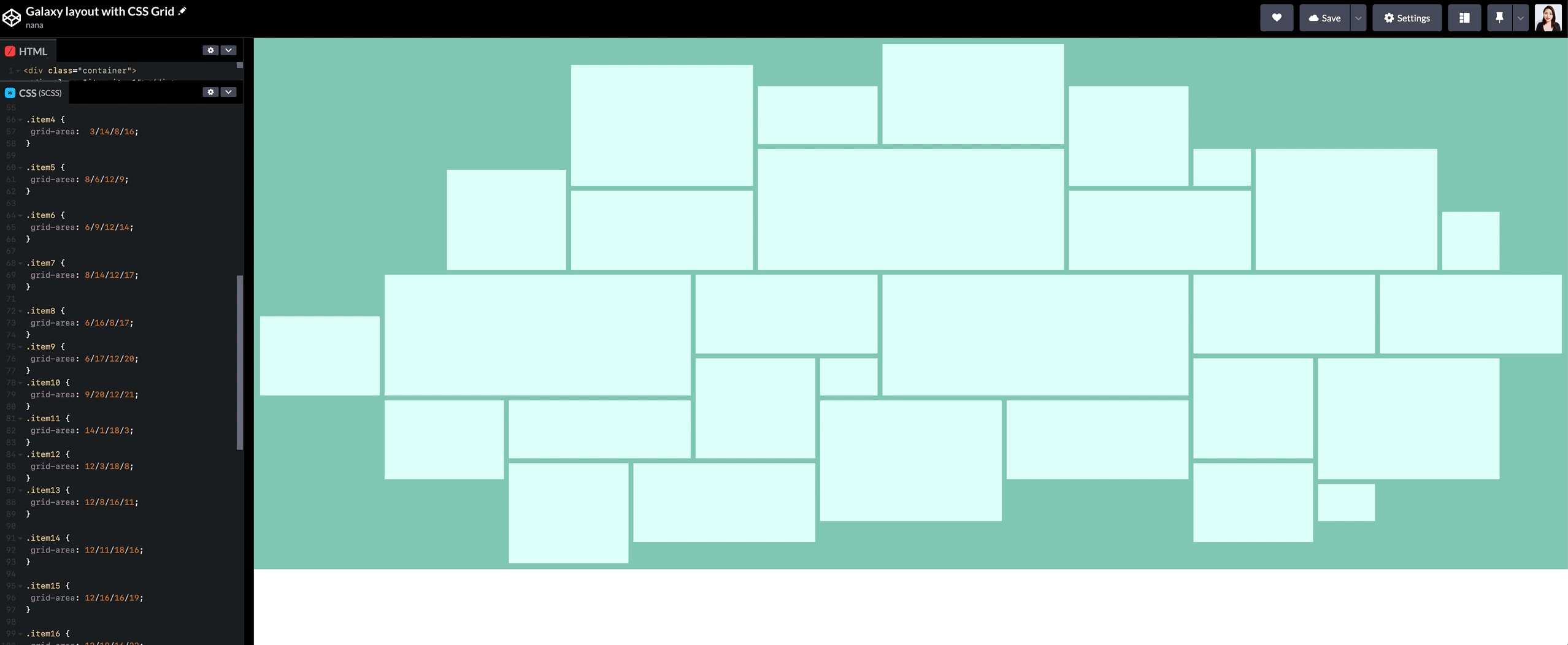
The below CodePen is the final result.
See the Pen
Galaxy layout with CSS Grid by nana (@nanacodesign)
on CodePen.
CSS grid tip
Tip 1. Implicit grid vs Explicit grid
The implicit grid is automatically defined grid by a browser.
The explicit grid is the manually defined grid.
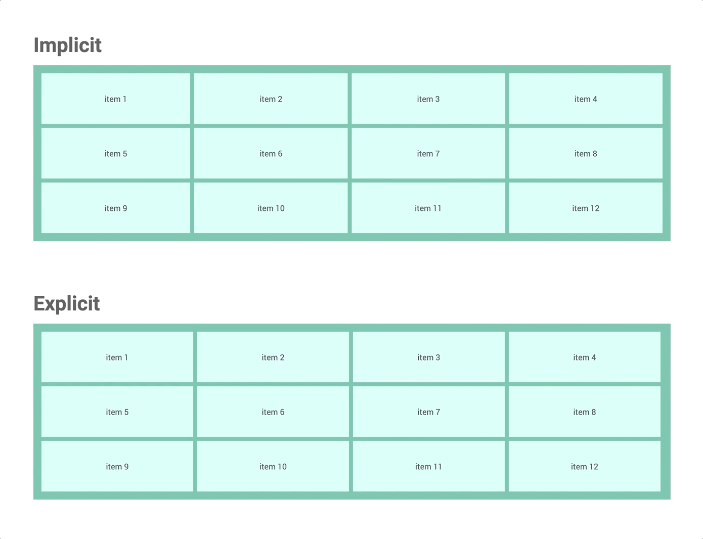
See the Pen
CSS grid: Implicit & Explicit by nana (@nanacodesign)
on CodePen.
Here is a recommended video for CSS GRID: Implicit vs Explicit Tracks — Wes Bos
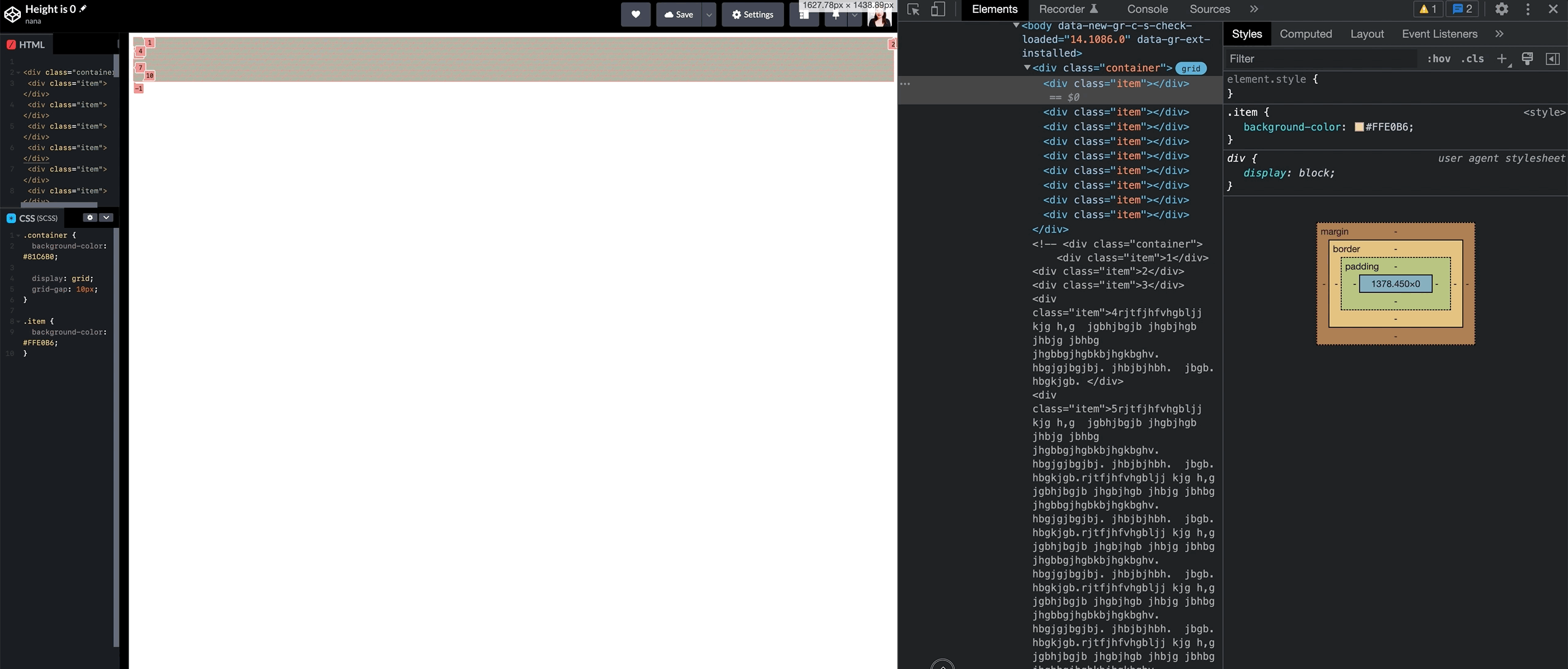
Tip 2. height value
The height CSS property specifies the height of an element. By default, the property defines the height of the content area. –mozilla
If the item hasn’t any content, the height is none. If the content has a 100px height, the height of the item becomes 100px too.
The code below will help you understand the height property.
See the Pen
Height by nana (@nanacodesign)
on CodePen.
Tip 3. Responsive height value
fr unit in the grid-templage-rows property doesn’t get any height value by the browser automatically unlike the width of the grid container for the grid-template-columns receives 100vw automatically from the below image.
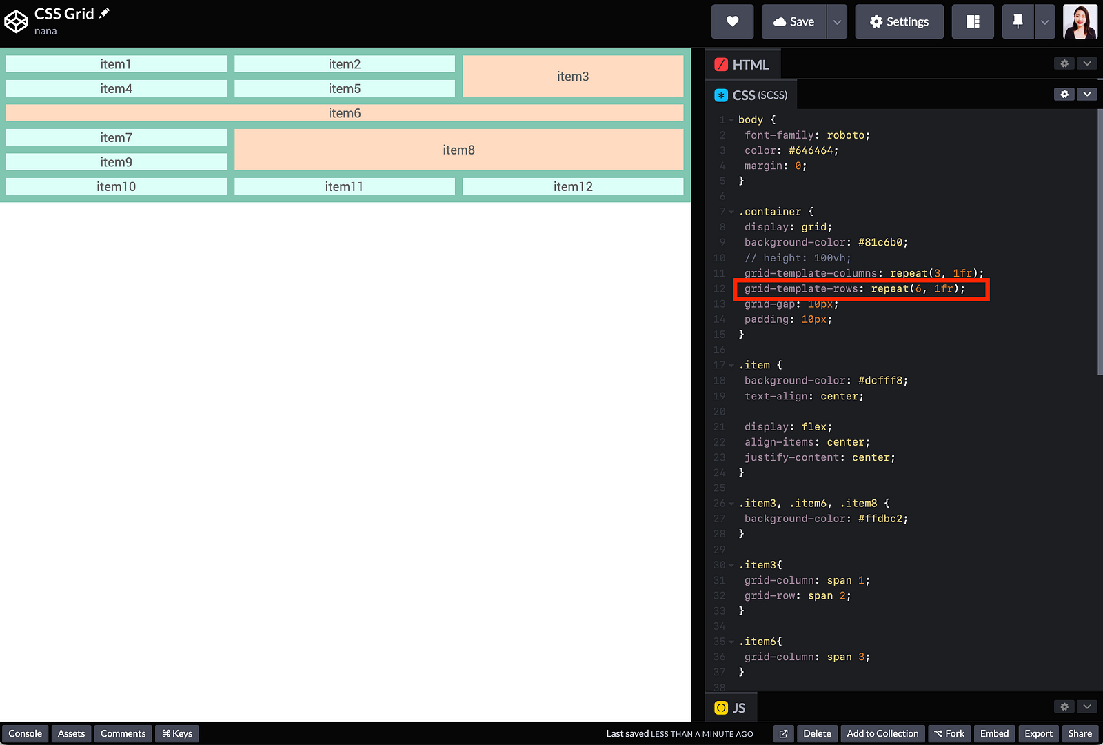
From the screenshot below, the browser doesn’t calculate the height value of the item even if the browser’s height gets changed.
However, even if there is no explicit width value in the block-level element specified, the browser automatically calculates the width value of the element by the browser size.
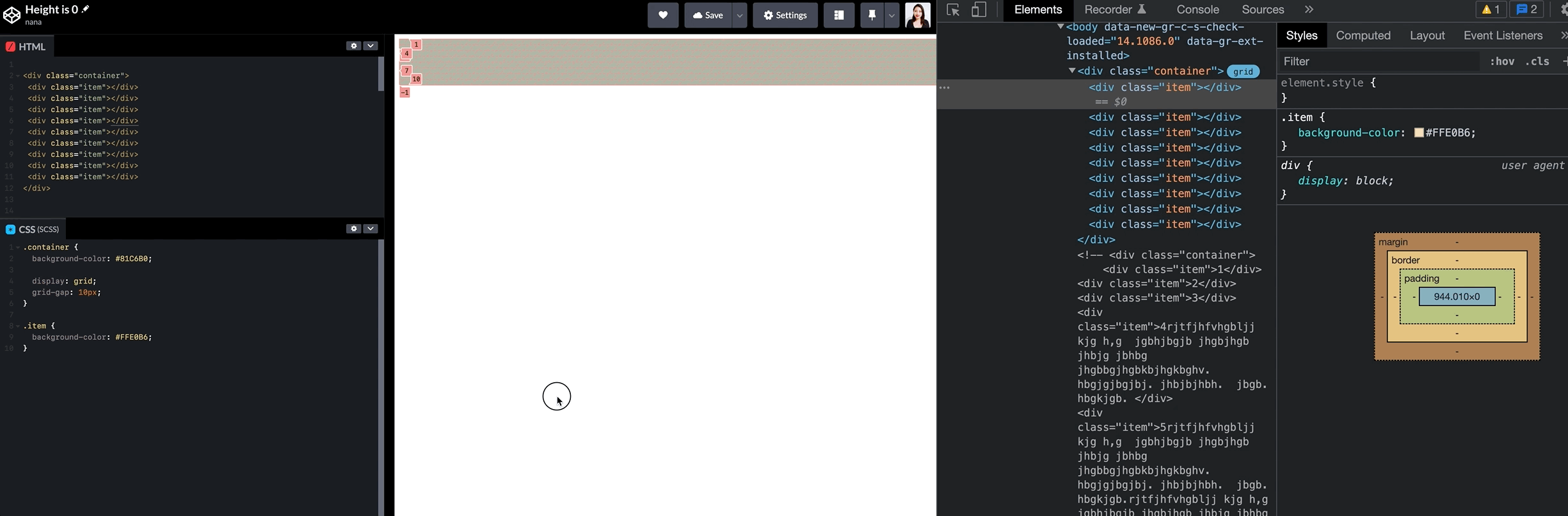
For this reason, if you wanted to use fr unit in the grid-templage-rows property and takes up the entire height of the screen, you should put an explicit height on the container.
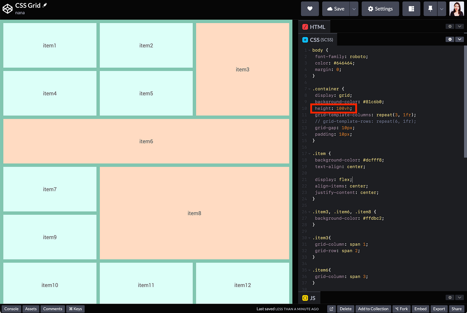
.container {
   height: 100vh;
   grid-template-row: repeat(6, 1fr);
}
See the Pen
CSS Grid: Height value by nana (@nanacodesign)
on CodePen.
Sneak Peek CSS Grid cheatsheet
CSS grid has a bunch of properties and different values. I often forget them when I revisit the CSS grid 😅. But my CSS Grid cheat sheet is my lifesaver. It helps me find proper CSS grid properties and values quickly.
I am thinking about how I can share this cheat sheet with everyone like the CSS selector cheat sheet I shared before. Please contact me to share your ideas and suggestions, and if you would like to support me for this cheat sheet project.
📚Resources
- • A Complete Guide to CSS Grid | CSS-Tricks by Chris House
- • CSS Grid Course by Wes Bos
- • Grid by example by Rachel Andrew
- • CSS Grid Basics by Jen Simmons
- • Web.dev > Learn CSS > Grid
- • Mozilla > CSS Grid Layout
- • Inspect CSS grid layouts
🙏 Huge thanks to everyone who shared experiences and perspectives.
💌 Any feedback or challenge
I would love to hear your feedback on how I can make this article better for everyone. Please leave me a comment below, Twitter or Linkedin. Please stay tuned and gives me love (👏) if you liked it. Thank you. 🤩


