
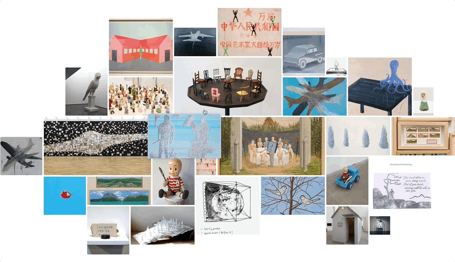
Kim Eull (1954 ~) is a contemporary Korean artist. The drawings of Kim Eull hold an expansive spectrum encompassing various genres including painting, sculpture, installation, etc.
🔗 Kim Eull
Kim Eull (1954 ~) is a contemporary Korean artist. The drawings of Kim Eull hold an expansive spectrum encompassing various genres including painting, sculpture, installation, etc.

Step 1. IA (Information Architecture) & wireframe
Step 2. Research references
Step 3. Discussions with the client and developer
Step 4. Prototyping
Step 5. CMS – WordPress
What I learnt …
Wrap-up
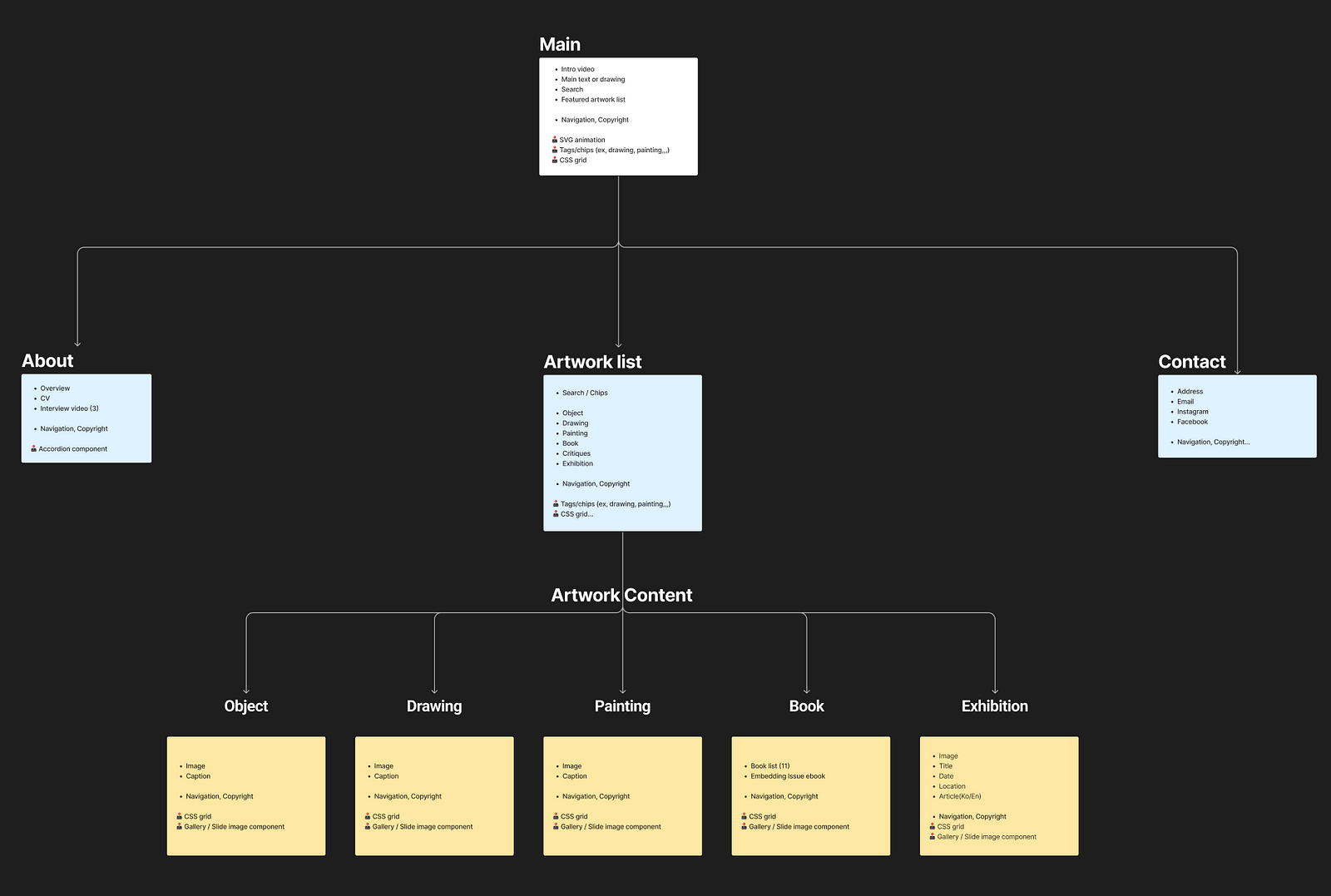
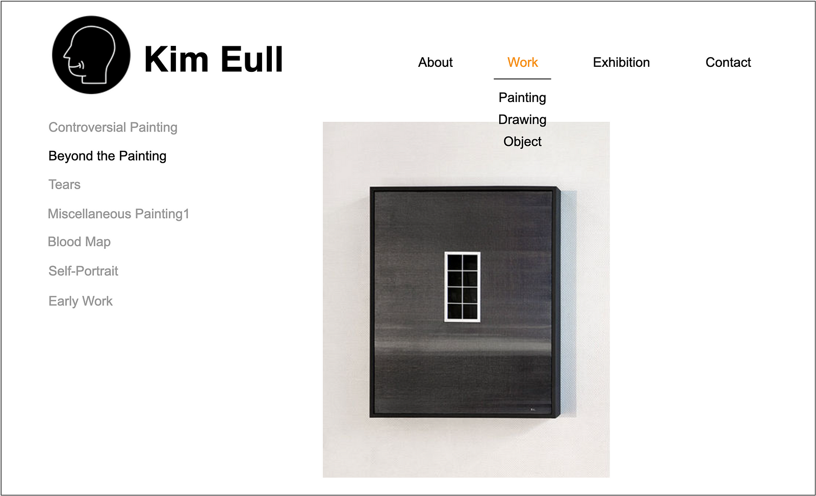
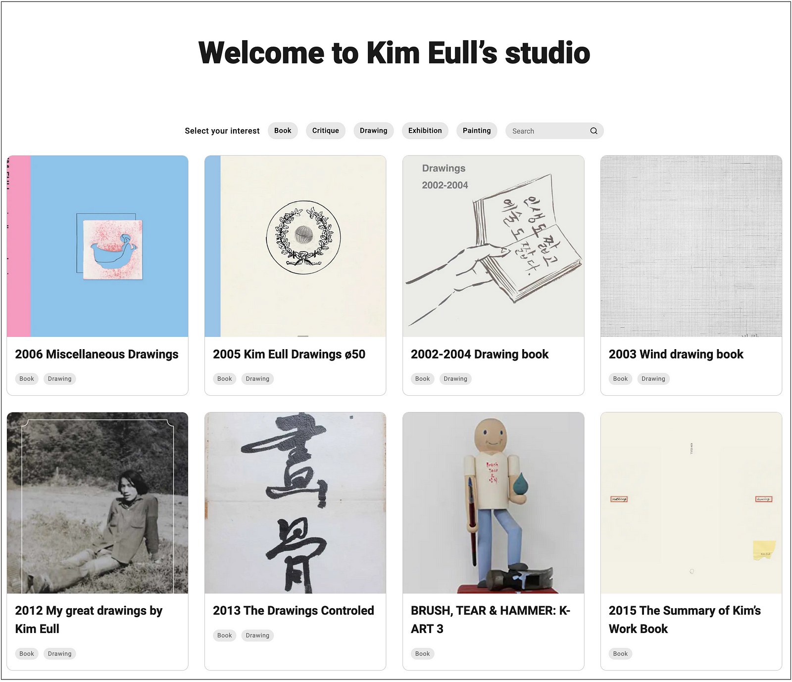
On his old website, the IA was divided by work genres such as Painting, Drawing and Object but I found that this structure didn’t work well. Because Kim Eull’s work is not limited to only a specific genre, but his work expands a variety of genres such as drawing, object, painting, installation and publication and many artworks include different genres together.
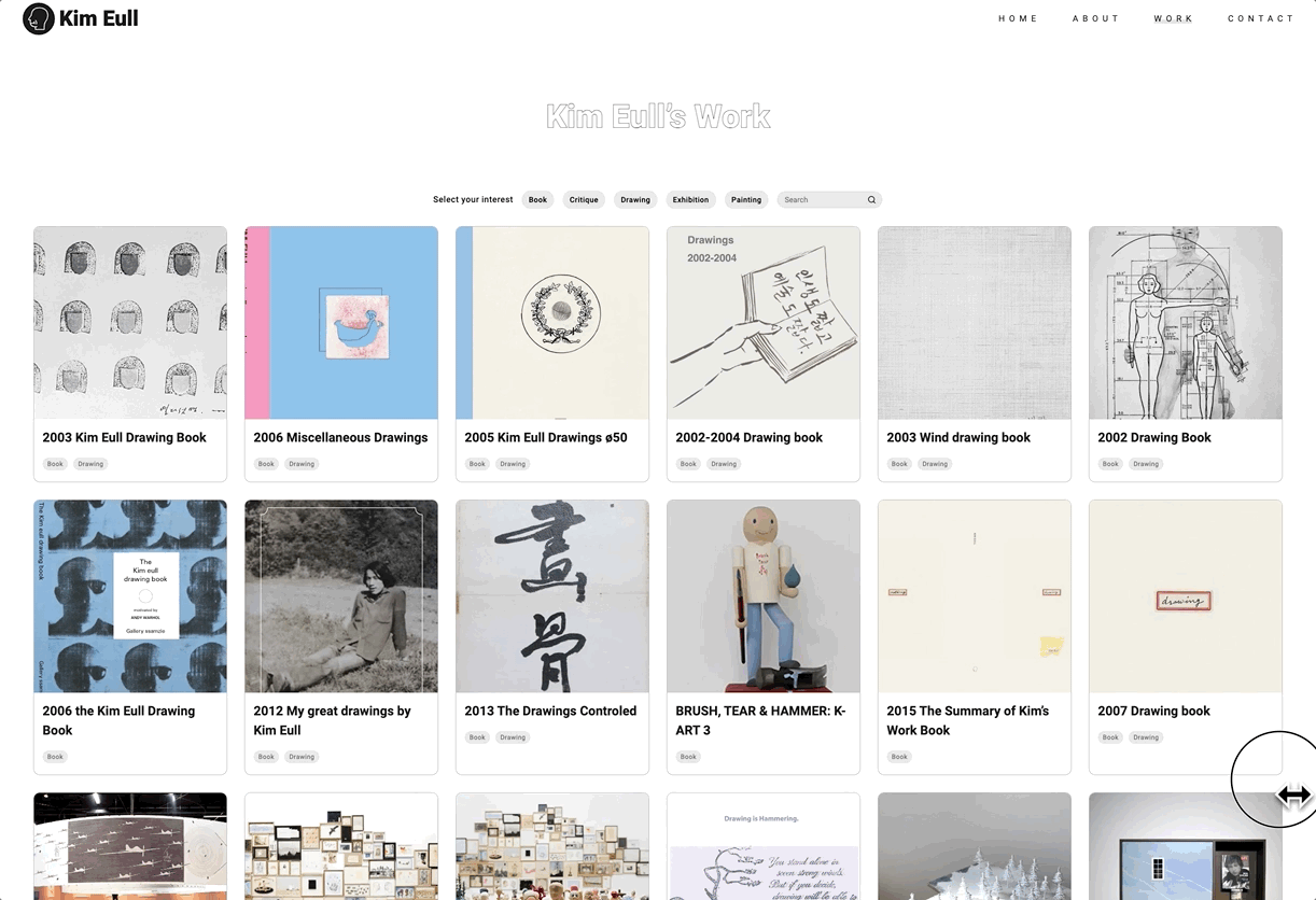
Therefore, I decided to make a use of tag/filter system instead of the menu category for the main navigation.
Before:
After:
In this IA stage, I always had those questions in mind.
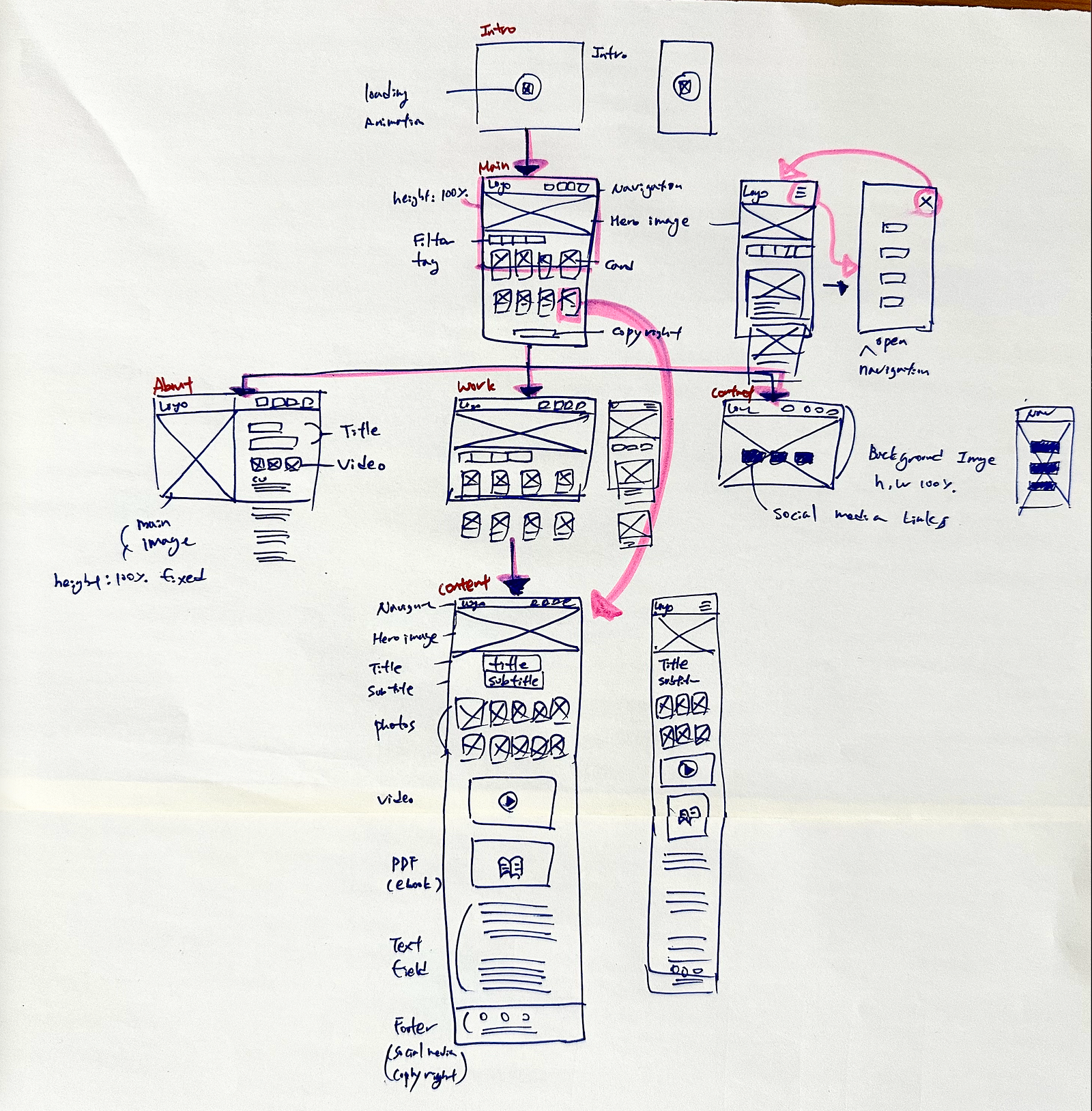
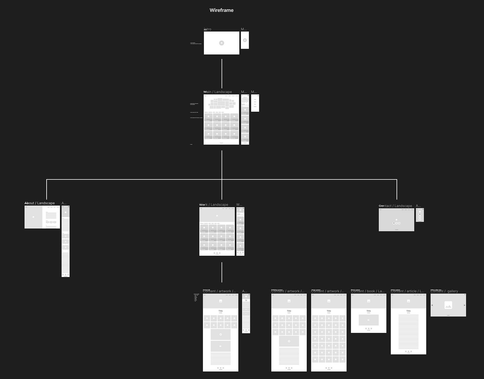
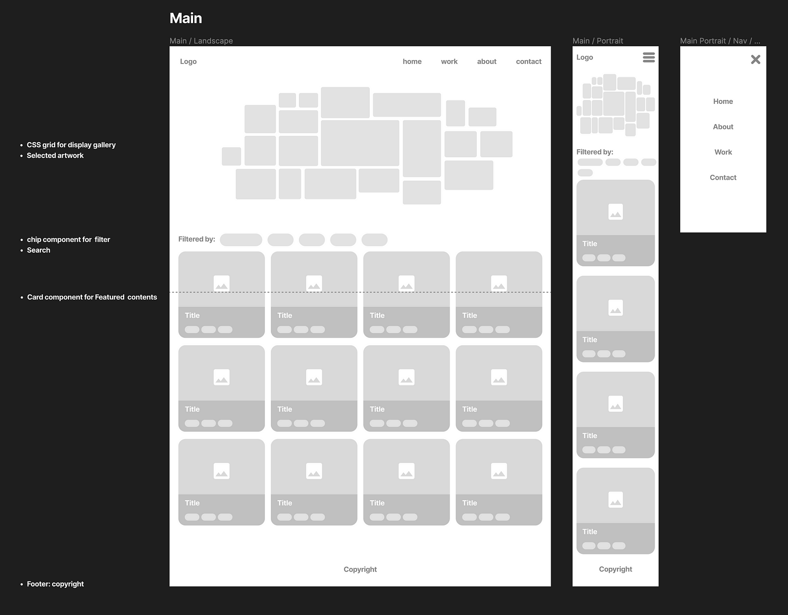
Based on the IA, I drew a wireframe by hand first and then moved to Figma.

Based on the wireframe, I started to research practical examples that can be implemented with code.
Here is the Gallery Pattern references.
I discussed the below list with the client and developer with the wireframe and design references.
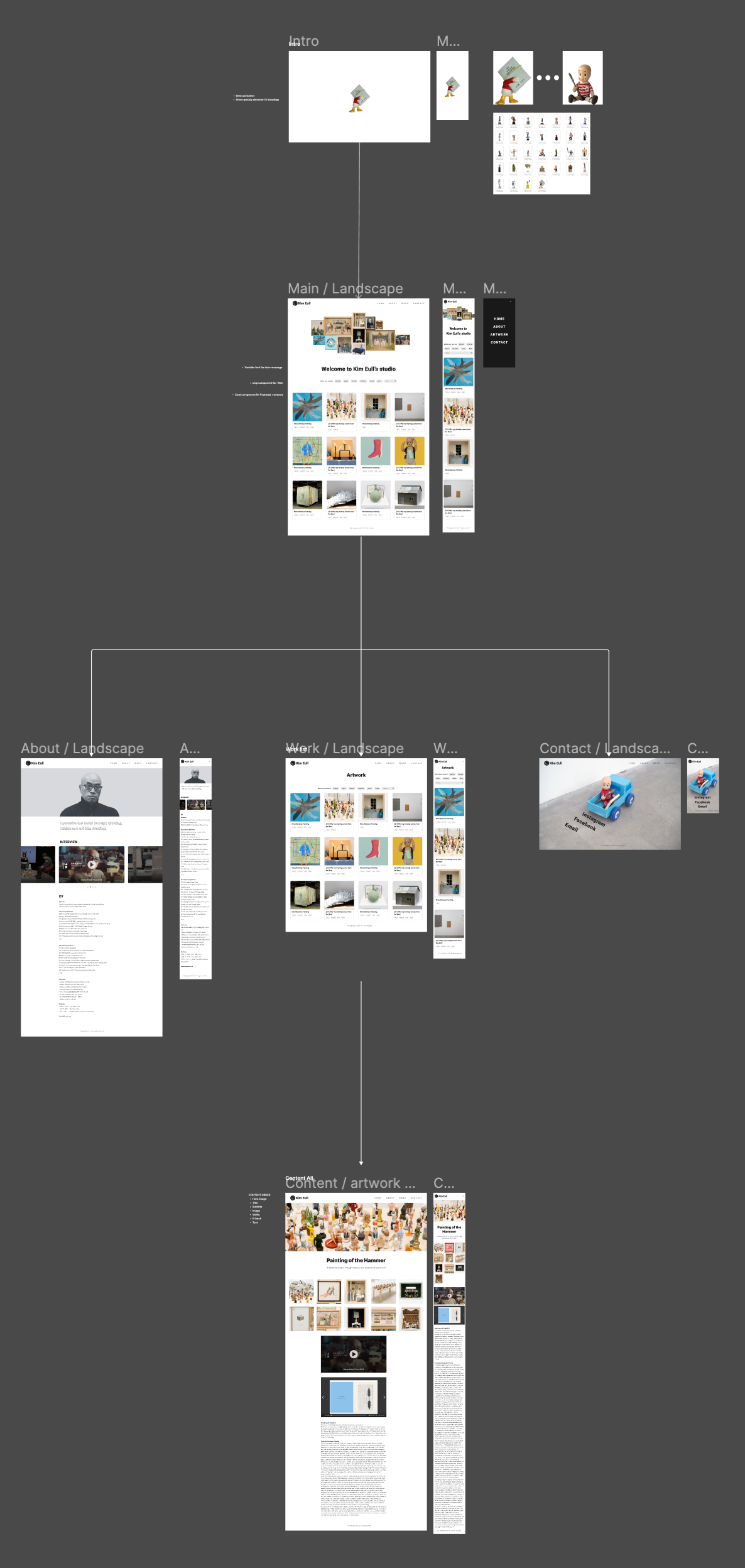
Based on the wireframe (low-fidelity) along with the design references and the discussions, I designed the high-fidelity in Figam.
Figma is an amazing prototyping and interface design tool. Though I prefer to check my design in the real browser/device (Chrome) in CodePen over the Present View in Figma. In Figma, it’s hard to visualise my design on the different browser sizes as well as animation effects. If there is any good way to preview prototyping in Figma, please let me know. 😉
After finishing high-fidelity prototyping, I organised the design kit to share with the developer.

Attempted with Hygraph and Strapi but went with WordPress.
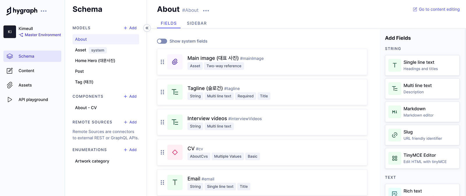
Ryan (Developer) initially used both HyGraph and Strapi to manage the content as he wanted to make use of GraphQL to fetch data.
But there were two big issues with them.
Both were related to the cost but the client didn’t want to spend too much money on the server so we decided to go with WordPress on Amazon LightSail and deployed the FrontEnd (Next.js) to Vercel.
I learnt 3 codesign skills from this project.
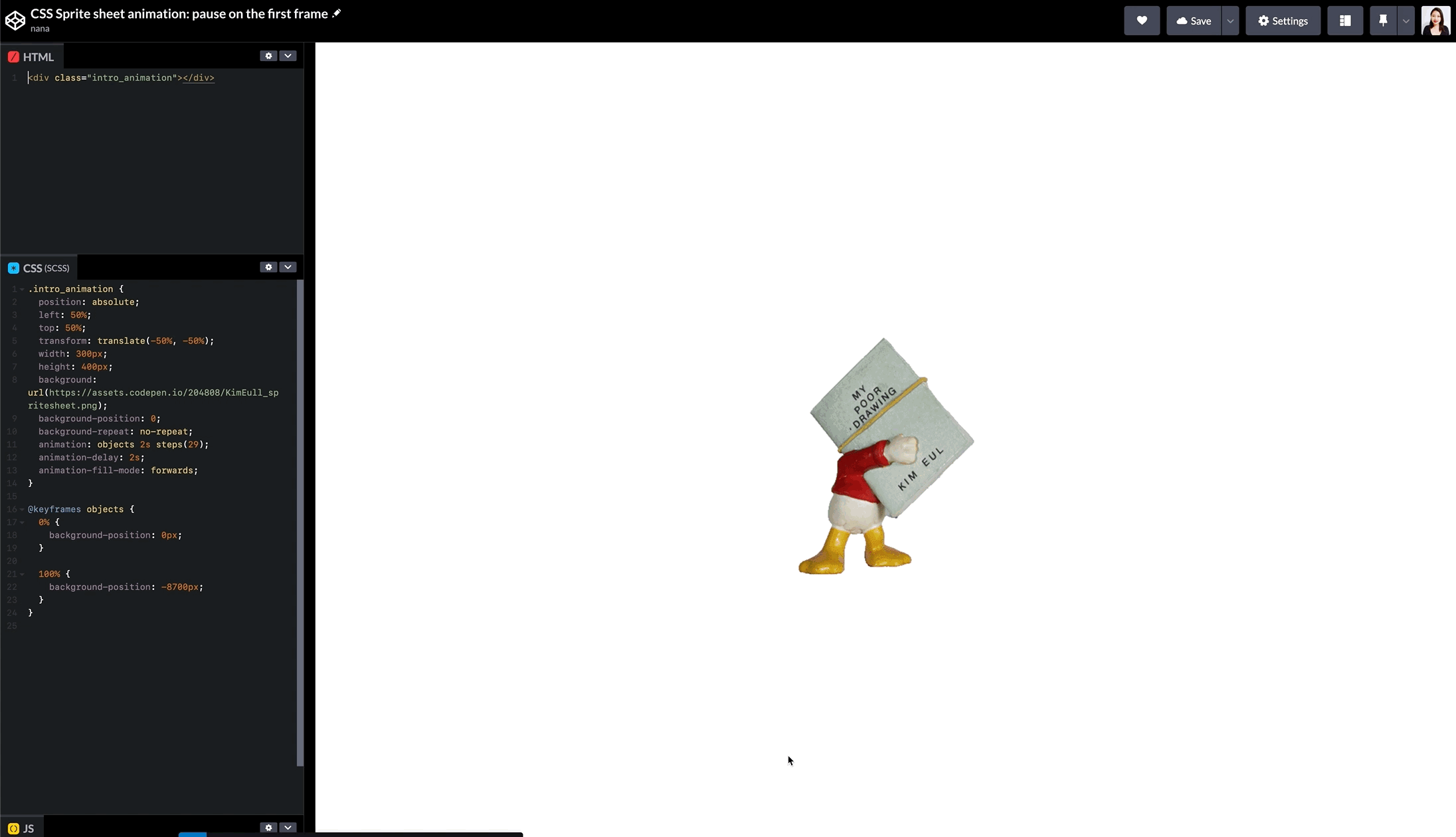
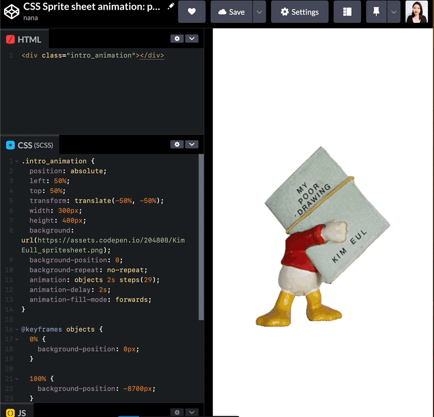
There are a lot of heavy images on this website, so I made a loading animation with CSS. So instead of showing heavy images loading, this short loading animation will be displayed while fetching the heavy images which provides a delightful experience for users.

Here is the technical article for the CSS sprite sheet animation.
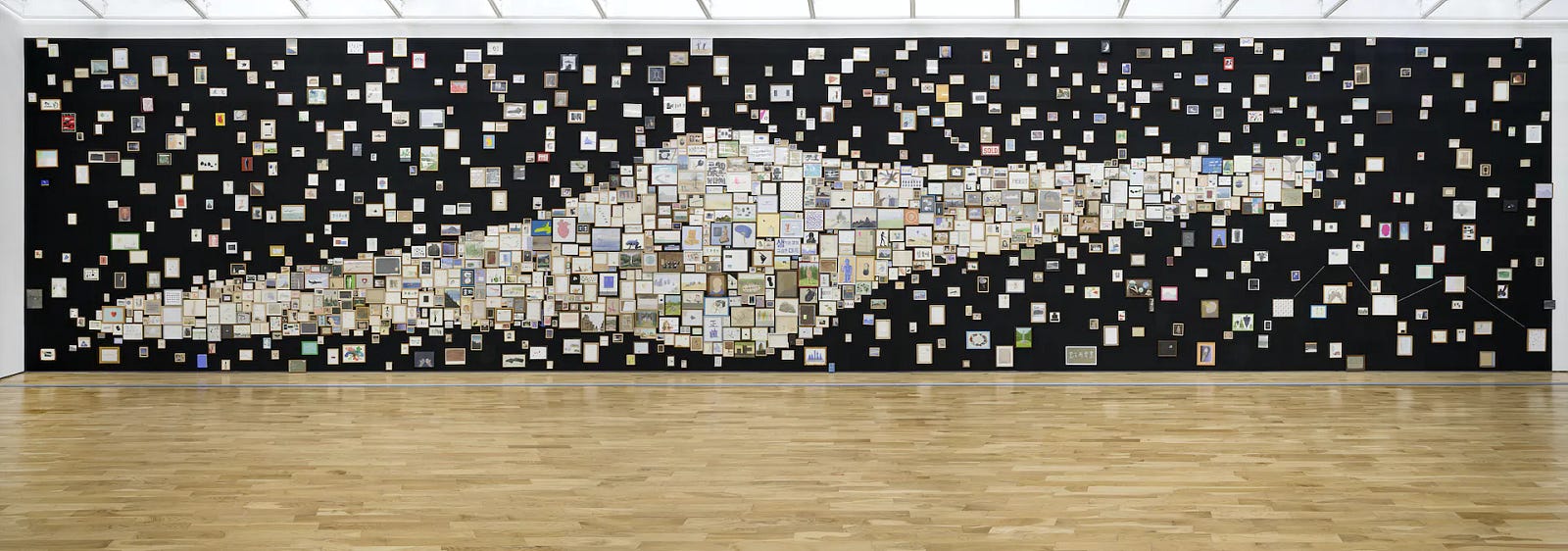
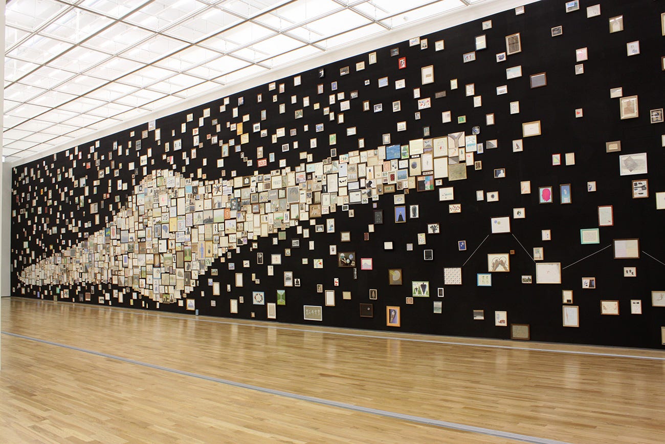
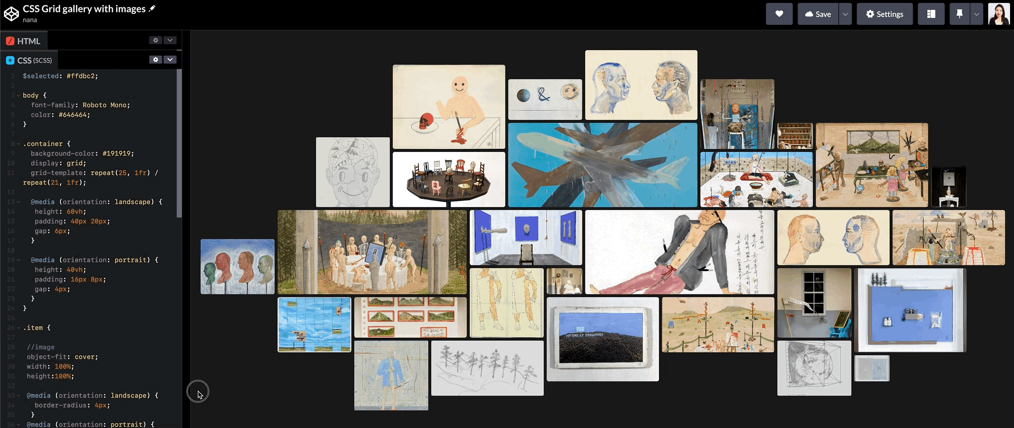
Galaxy is one of Kim Eull’s signature artworks, and it was installed with Kim Eull’s 1,450 drawings. When I saw this installation artwork, I wanted to bring it online as is. When I saw it the first time, I thought I could visualize it using CSS Grid easily. But it was harder than I expected to make the Galaxy shape with 1,450 drawings 😅.
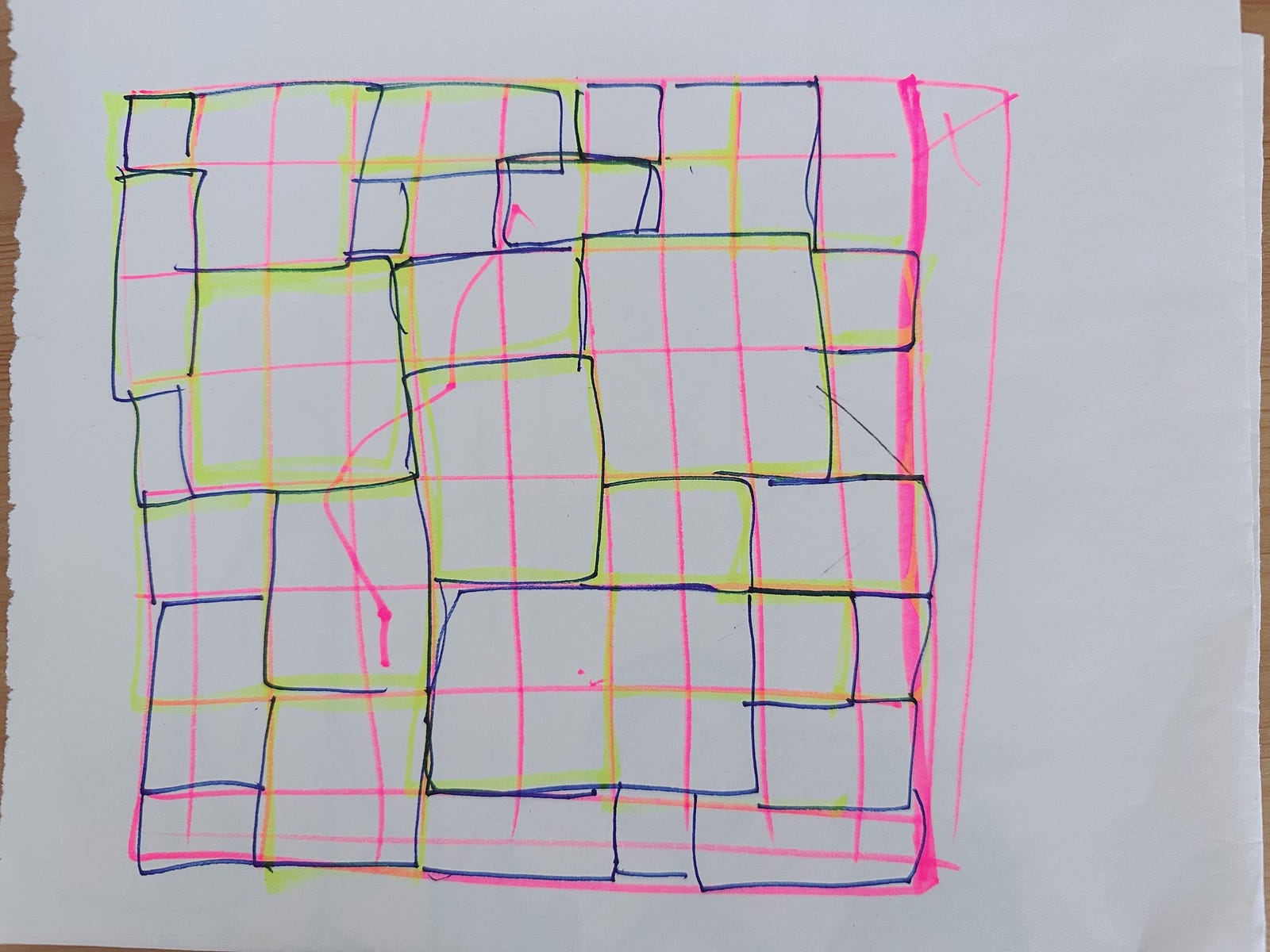
The above drawing was my first attempt to make the Galaxy grid but it didn’t work as expected.
So I researched more on the CSS Grid techniques.
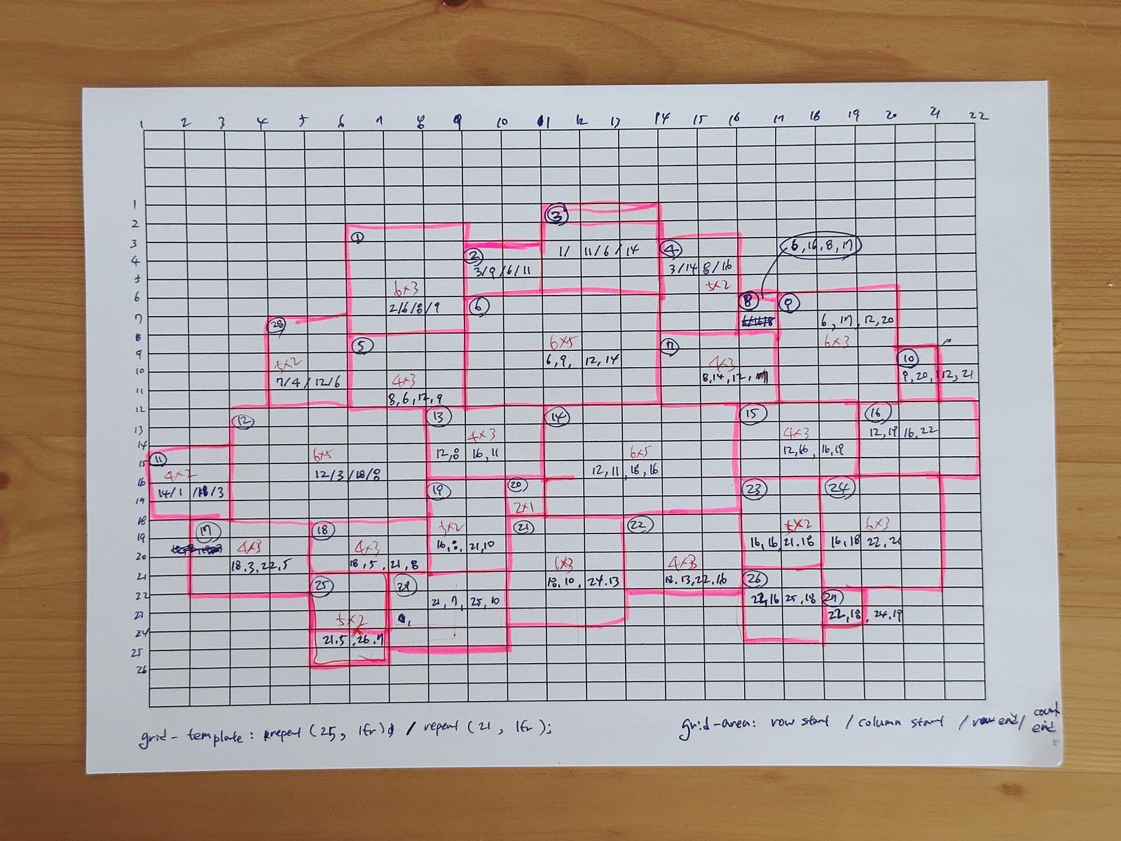
After researching CSS Grid, I found the best way to create the Galaxy shape using CSS Grid. Please check this article for more details. Below is a snapshot of the article.

Here is the technical article for the Galaxy layout with CSS Grid.
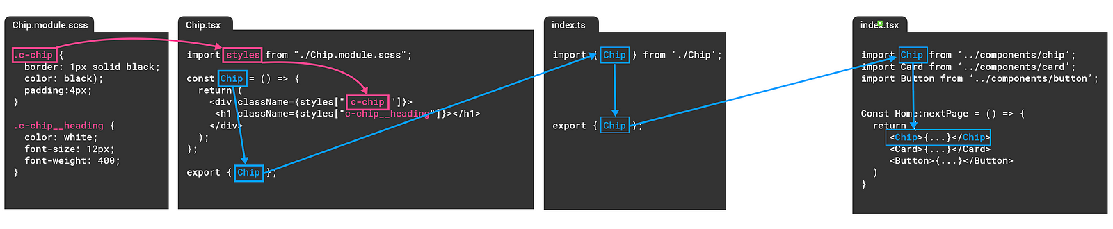
React is one of the most popular frameworks and it is used in many companies. I wanted to know how I can design products (websites) to be compatible with React, especially UI components more efficiently and flexibly.
I wrote a note about Understanding the basics of React if you want to read more.

Understanding those techniques (CSS, JavaScript and React) gave me opportunities to design components and pages more efficiently and it helped this project to provide a better user experience for the users but also a better coding experience for the developers too.
I feel confident
I learnt a lot from this project and it gave me a great chance to get my design sense back on track from the absence of parental leave. I enjoyed this project.
💌 Any feedback or challenge
I would love to hear your feedback on how I can improve this article. Please leave me a comment below or on Twitter.
🎈 That’s all for now
Please stay tuned and gives me love (👏) if you liked it. Thank you.
Happy Codesign today. 🧙🏻♀️

