
This article was published on UX Collective on 20 May 2025
Figma Grid, a brand-new tech?
Don’t be afraid of it. 😎

I’ve just published “CSS grid with Galaxy layout: now available in Figma sharing how I used Grid on a client website sometime ago, and share creative ideas to spark your imagination, whether you’re a designer, developer, or both.
Back in 2005, Bert Bos published the CSS3 Advanced Layout draft. After nearly two decades of work by the CSS Working Group and passionate advocates, CSS Grid has evolved into one of the most powerful layout systems for the web and developers have been using it in production for years.
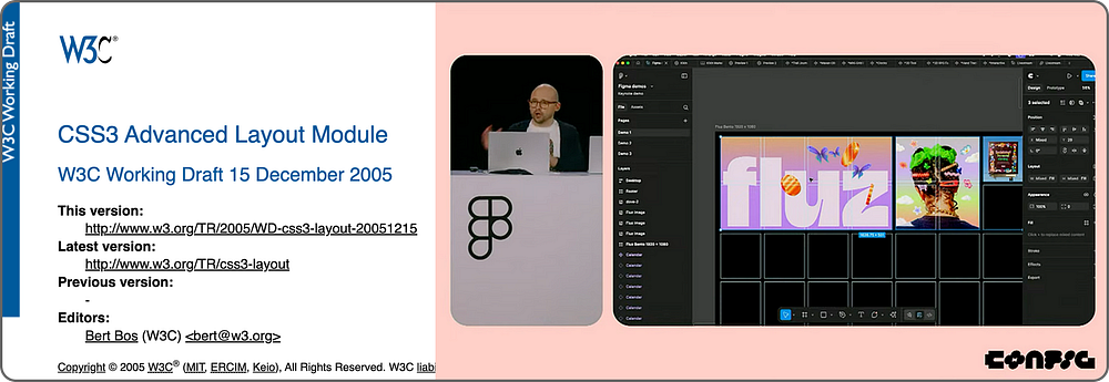
Now, in 2025, designers can finally experience CSS Grid directly in Figma. Hopefully, Figma will continue evolving to support all CSS properties, functions, data types, and values, so design and code can align even more seamlessly. 🤝✨
To show what’s possible, I will show you through how I used CSS Grid to recreate a large scale installation artwork on the web from concept to implementation. Galaxy (2016) is one of the signature works by Korean contemporary artist Kim Eull, consisting of 1,450 individual drawings. The moment I saw it, I knew it could be reimagined with CSS Grid.


When I saw it, I thought it could be quite easy to re-create and visualise it using CSS Grid. 😎

But it was more complicated than I expected making the Galaxy layout in CSS Grid with 1,450 drawings 😅.
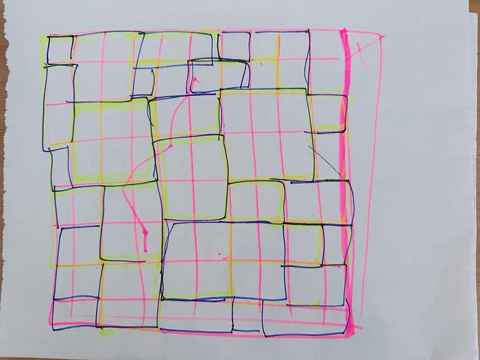
My first draft involved sketching a rough grid layout inspired by the installation. From there, I defined the following design goals:
🎯 Design Goals
⚙️ Image configurations in WordPress
① Understand the CSS grid structure
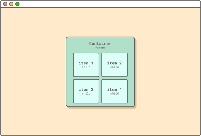
Let me briefly explain the basics of CSS Grid. Think of CSS Grid like an IKEA IVAR shelf: the container is the outer frame, and the items are the individual cells. Define the frame, decide the rows and columns, and then neatly arrange your content, just like organising your favourite shelf.

IKEA IVAR © Inter IKEA Systems B.V. 1999–2023
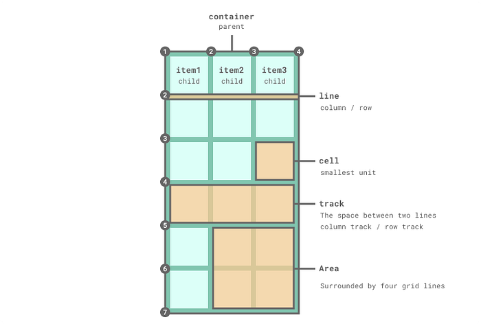
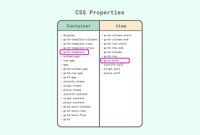
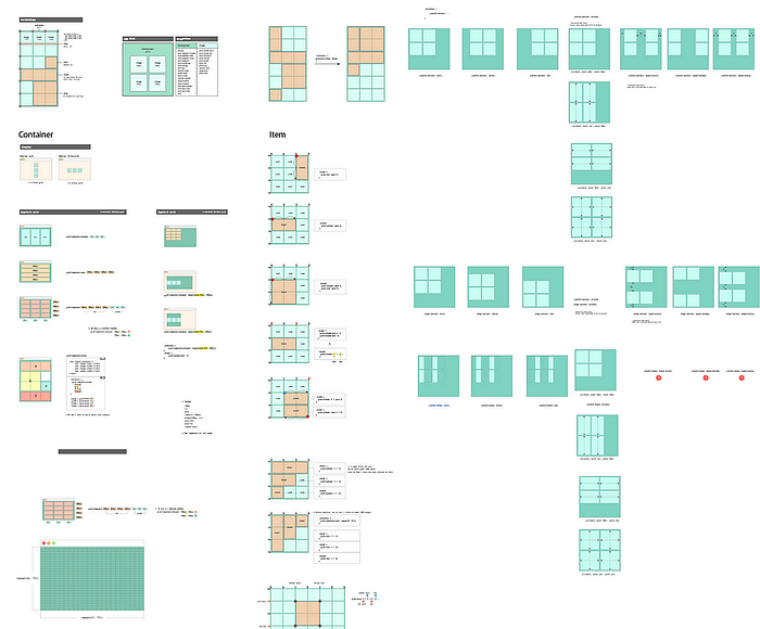
I hope this cheat sheet I made for this article helps you understand the CSS grid structure. 🧙🏻
grid-area② Find suitable properties
As you can see from the CSS Grid cheatsheet below, CSS Grid has many properties and values as well as various features. It was important to find suitable properties and values of CSS Grid for the Galaxy layout. I tried all properties and found grid-template containers and grid-area items worked best for the Galaxy layout.
① Sketch the layout by hand (now in Figma!)
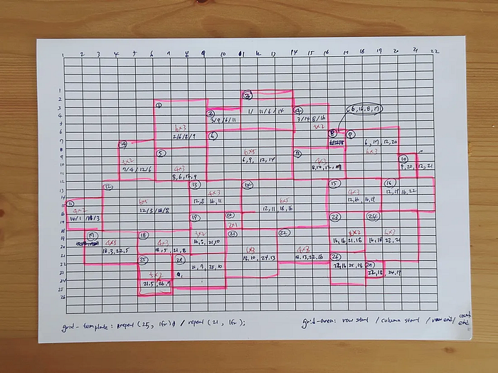
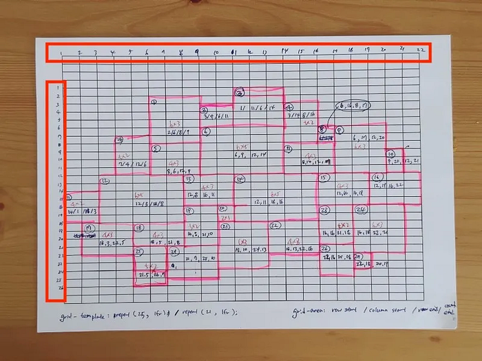
To define grid-area values visually, I printed a grid and sketched the Galaxy layout by hand. Back then, Figma didn’t support grid layouts like it does now so I had to draw by hand.
But now, thanks to Figma’s new Grid feature, you can map and plan layouts much more easily 🙌
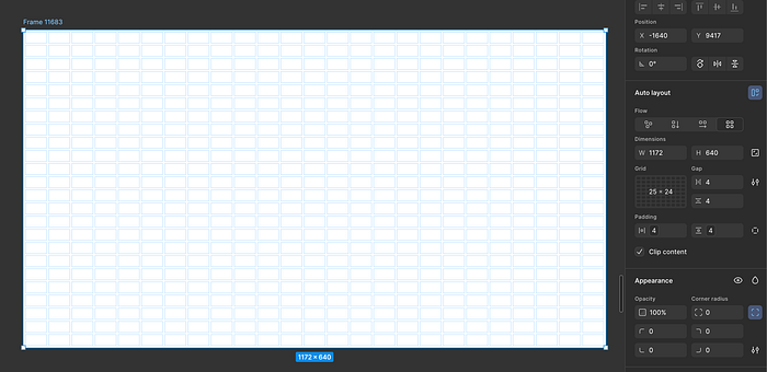
That said, while I really enjoyed using Figma Grid, I noticed a few limitations that made it tricky to recreate the Galaxy layout precisely.
🚧 A Few Limitations in Figma Grid
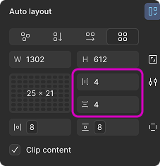
px values for grid gaps, but I need to use primitive values from our design system library to ensure consistency across components and patterns. It would be great if Figma supported variables or design tokens for this.⚠️ Note: Gaps in CSS can use any length unit or percentage — but not fr.
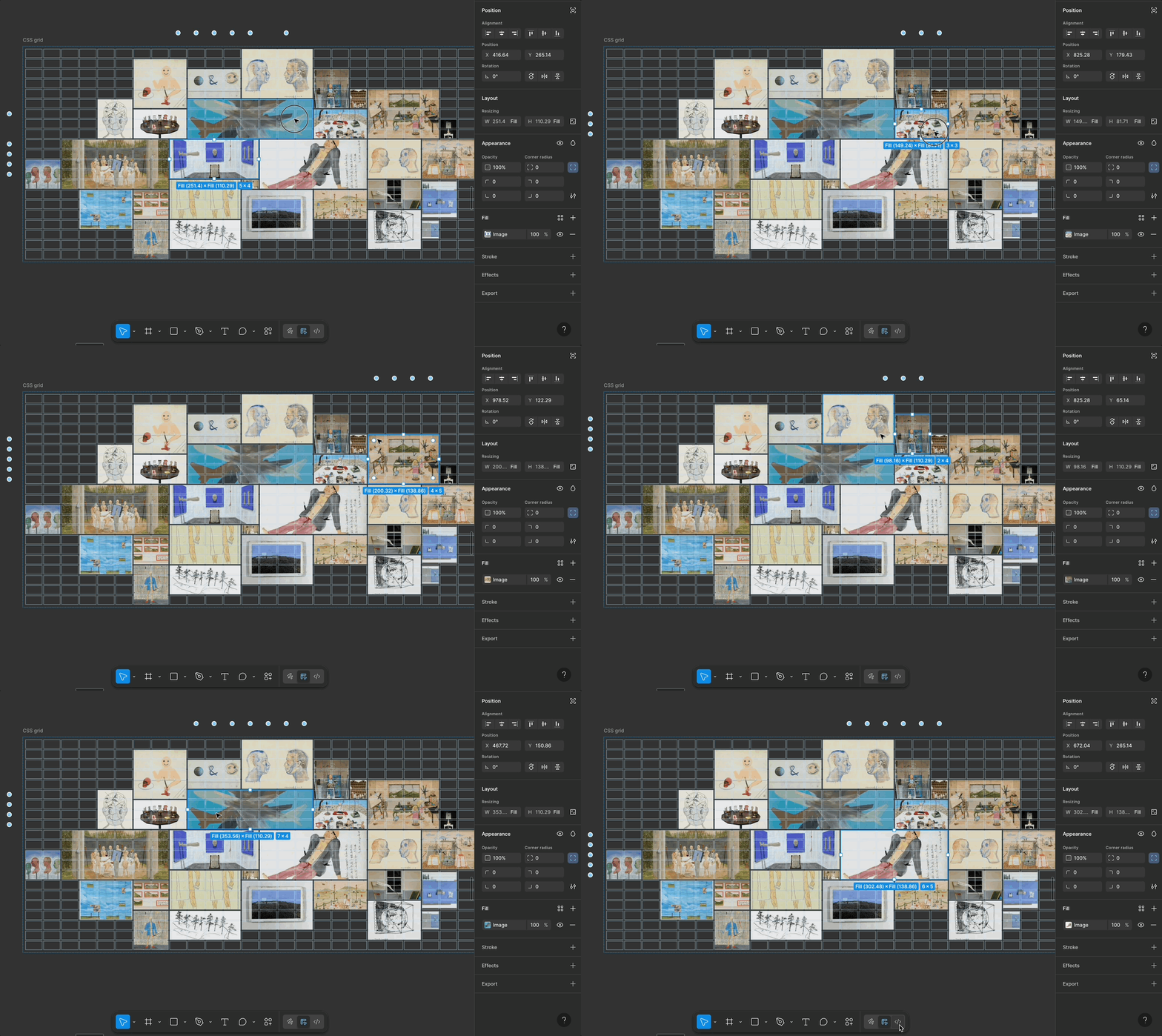
justify-items, align-items, place-content, etc. Figma currently only supports basic alignment and fixed units. This limits the full expressive potential of CSS Grid.🙏 If you’ve found any tricks or tips for these challenges, I’d truly appreciate it if you shared them!
Despite these challenges, I believe Figma will continue to evolve and support more CSS properties, functions, data types, and values, aligning design and code even more seamlessly. If you have tips for that, please share!
Now, let’s go back to the process of building the Galaxy layout.
② Numbering the grid lines
I labeled each row and column in the sketch, these line numbers help define each grid item’s position using the grid-area shorthand.
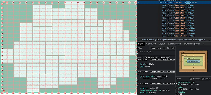
Also, we can inspect these numbers in the Chrome DevTools like below.
③ Set the grid container

Here is the CSS code for the container. I used the repeat CSS function to create a certain number of columns and rows, grid-template shorthand with repeat() to create a 25×21 grid.
④ Define Grid Items
Now I had 525 grid cells. To specify the grid item’s size and location for the Galaxy layout, I defined grid-area shorthand property for 29 items.
grid-area value: row-start / column-start / row-end / column-end
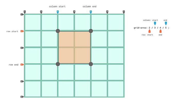
Here is the CSS code for the 29 items.
//item position

.item1 {
 grid-area: 2/6/8/9;
}

.item2 {
 grid-area: 3/9/6/11;
}

.item3 {
 grid-area:  1/11/6/14;
}

......


.item27 {
 grid-area: 22/18/24/19;
}

.item28 {
 grid-area: 7/4/12/6;
}

.item29 {
 grid-area: 21/7/25/10;
}
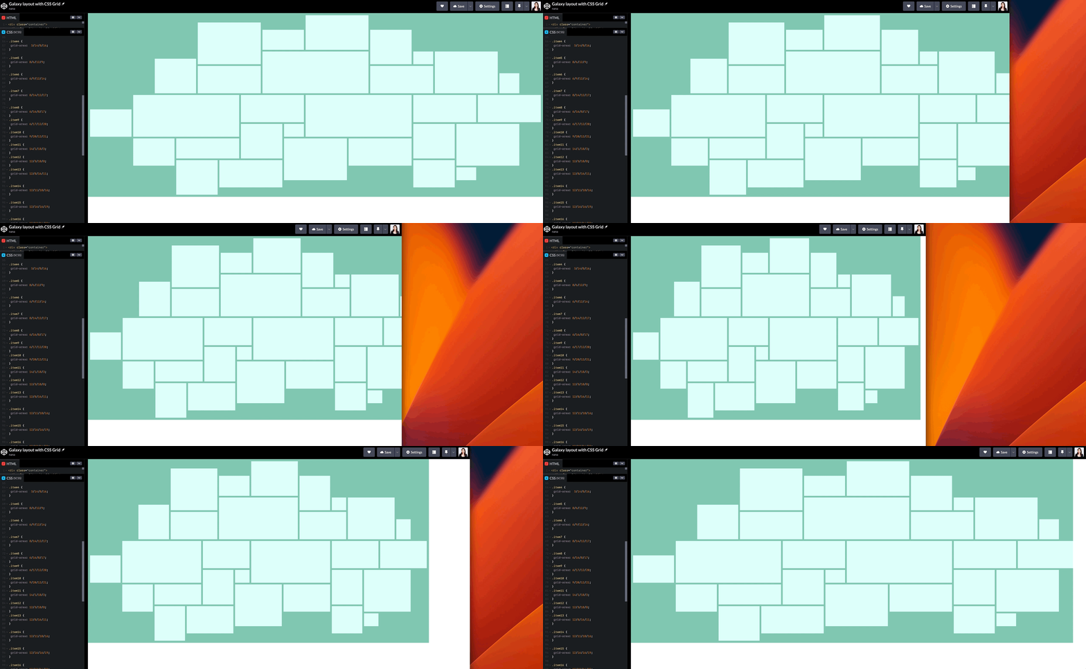
⑤ Insert Images into HTML
As the final step, I selected artwork images that matched each grid item’s shape to avoid awkward cropping. One day, I hope we’ll have a CSS algorithm smart enough to auto-pick image ratios. 😉
After building the Galaxy layout with CSS Grid, I took a moment to reflect, just like in any good design process. Looking back helped me identify what worked, what surprised me, and what I’d do differently next time. Here are three insights that stood out:
① Implicit grid vs Explicit grid
grid-template-columns and grid-template-rows.Understanding the difference helps you take full control of your layout.
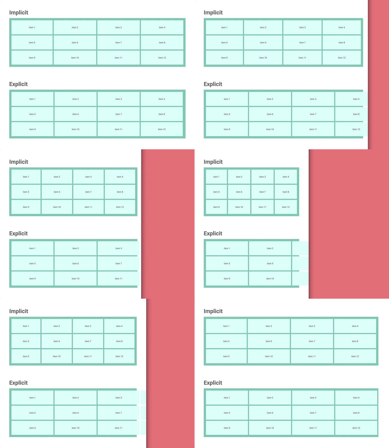
👉 Watch: Wes Bos — Implicit vs Explicit Tracks
② How height works in CSS
The height CSS property specifies the height of an element. By default, the property defines the height of the content area. –MDN
The height property controls an element’s vertical size.
By default, it matches the height of the content inside.
③ fr units need explicit height
💡 Height doesn’t update automatically like width does.
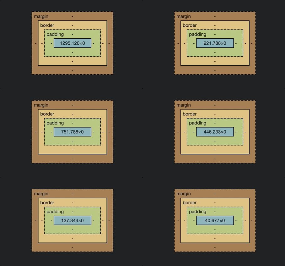
Unlike columns, which adjust to screen width, rows using fr units don’t respond the same way. If the container has no defined height, the browser can’t calculate row heights, causing layout issues like the one shown below.
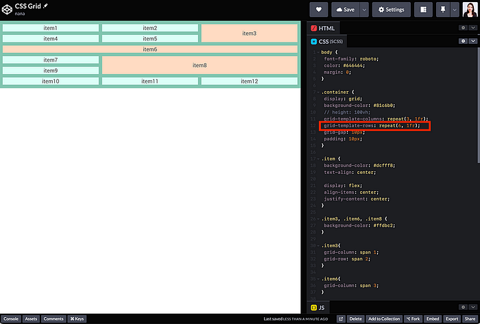
fr units need explicit heightThe browser can’t calculate row heights, which can cause the layout to break unexpectedly, as shown bwhelow.
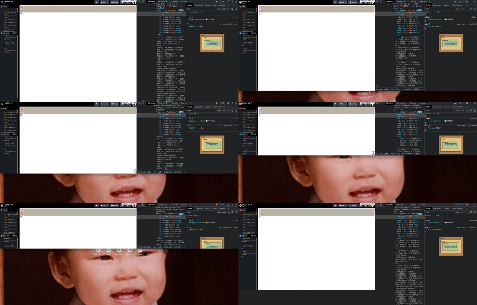
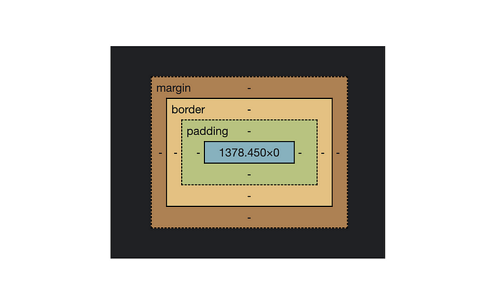
Whereas, even if there is no explicit width value in the block-level element specified, the browser automatically calculates the width value of the element by the browser size.
For this reason, if you wanted to use fr unit in the grid-templage-rows property and takes up the entire height of the screen, you should put an explicit height on the container.
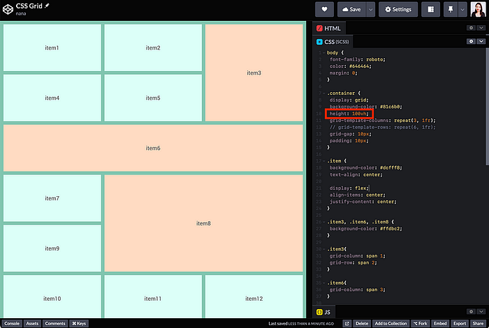
fr unit in the grid-templage-rows property and takes up the entire height of the screen.container {
height: 100vh;
grid-template-row: repeat(6, 1fr);
}
Even now, I often forget CSS Grid properties when revisiting projects 😅. That’s why I created a CSS Grid Cheatsheet, a quick reference to help me remember and apply the right values fast.
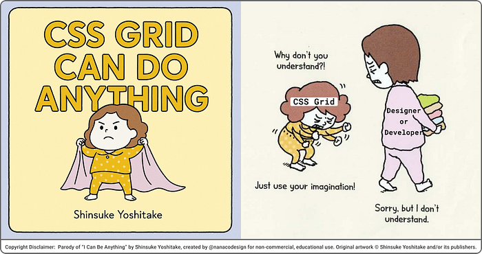
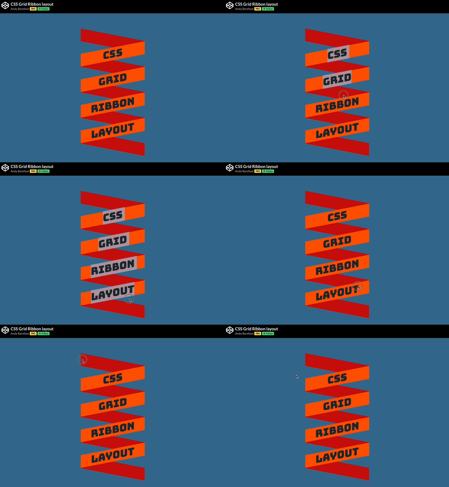
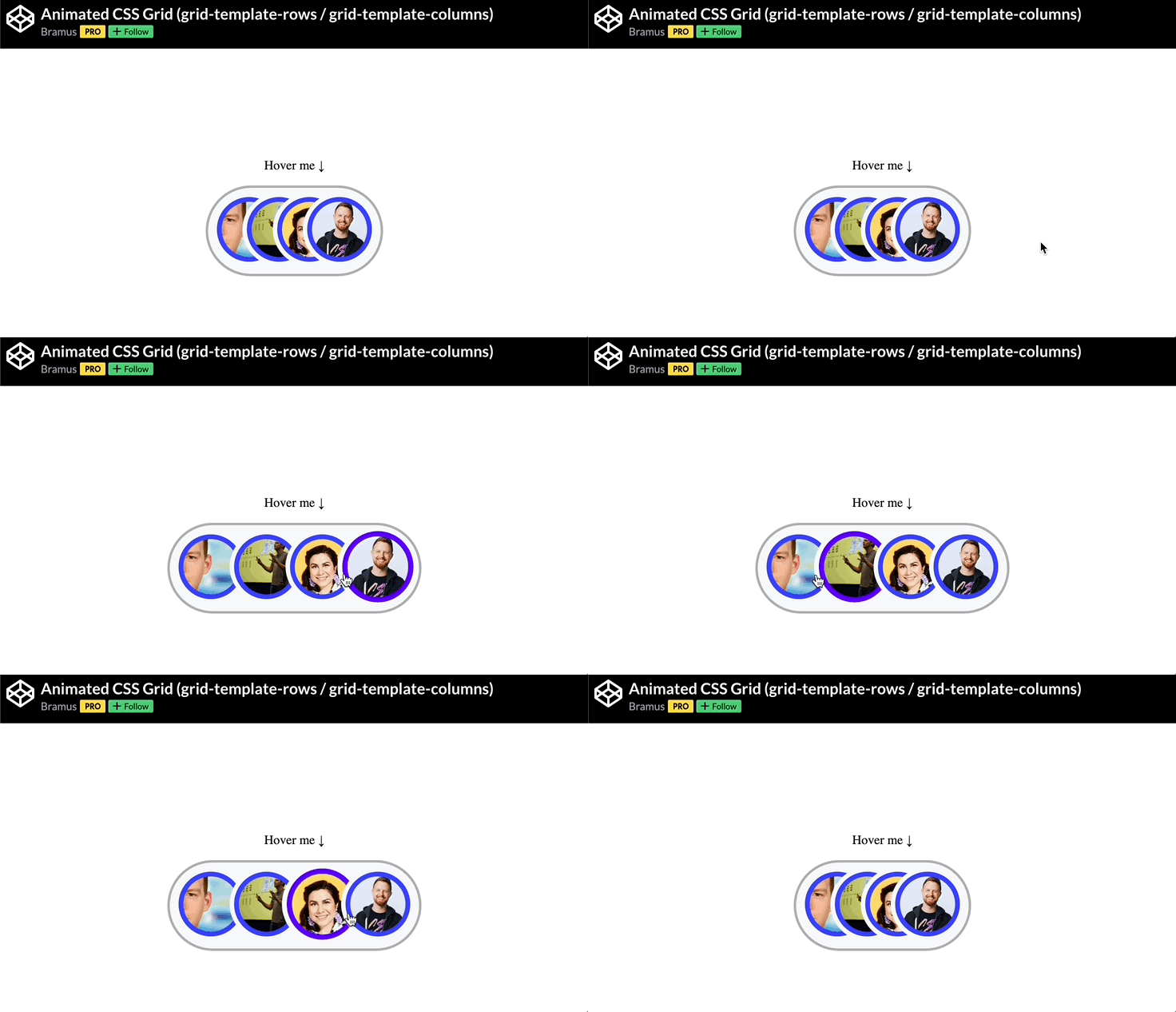
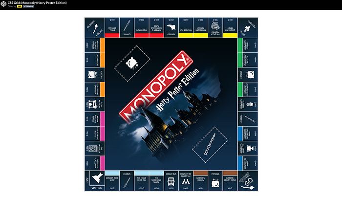
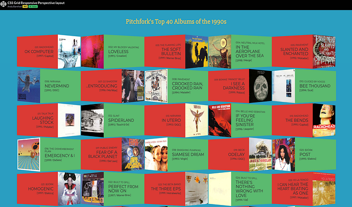
CSS Grid is far more powerful than just card layouts. Developers have explored it for years to create animations, 3D effects, and interactive designs with ease.
To help you see what’s possible, I’ve collected some brilliant CodePen demos that show CSS Grid in action. These are real examples that you can explore, learn from, or adapt directly into your own projects:
🕹️ CSS grid codepen collection
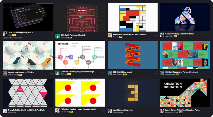
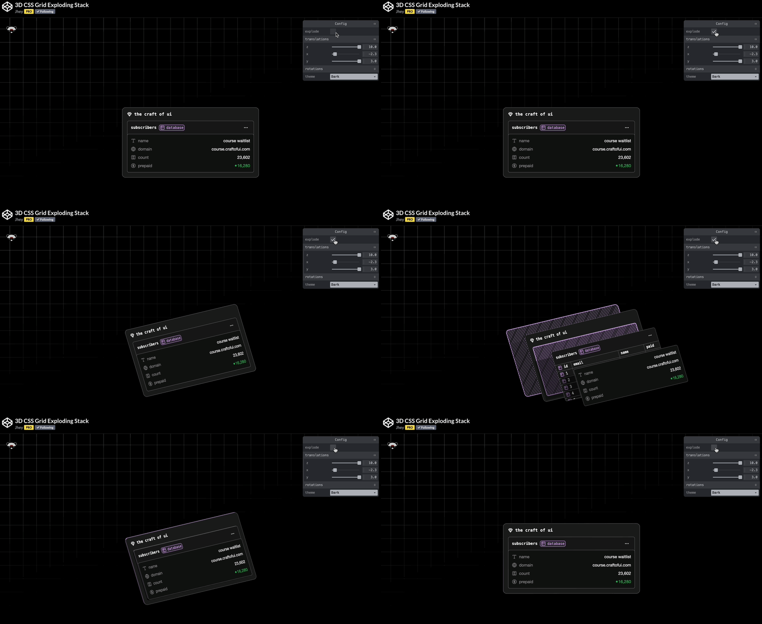



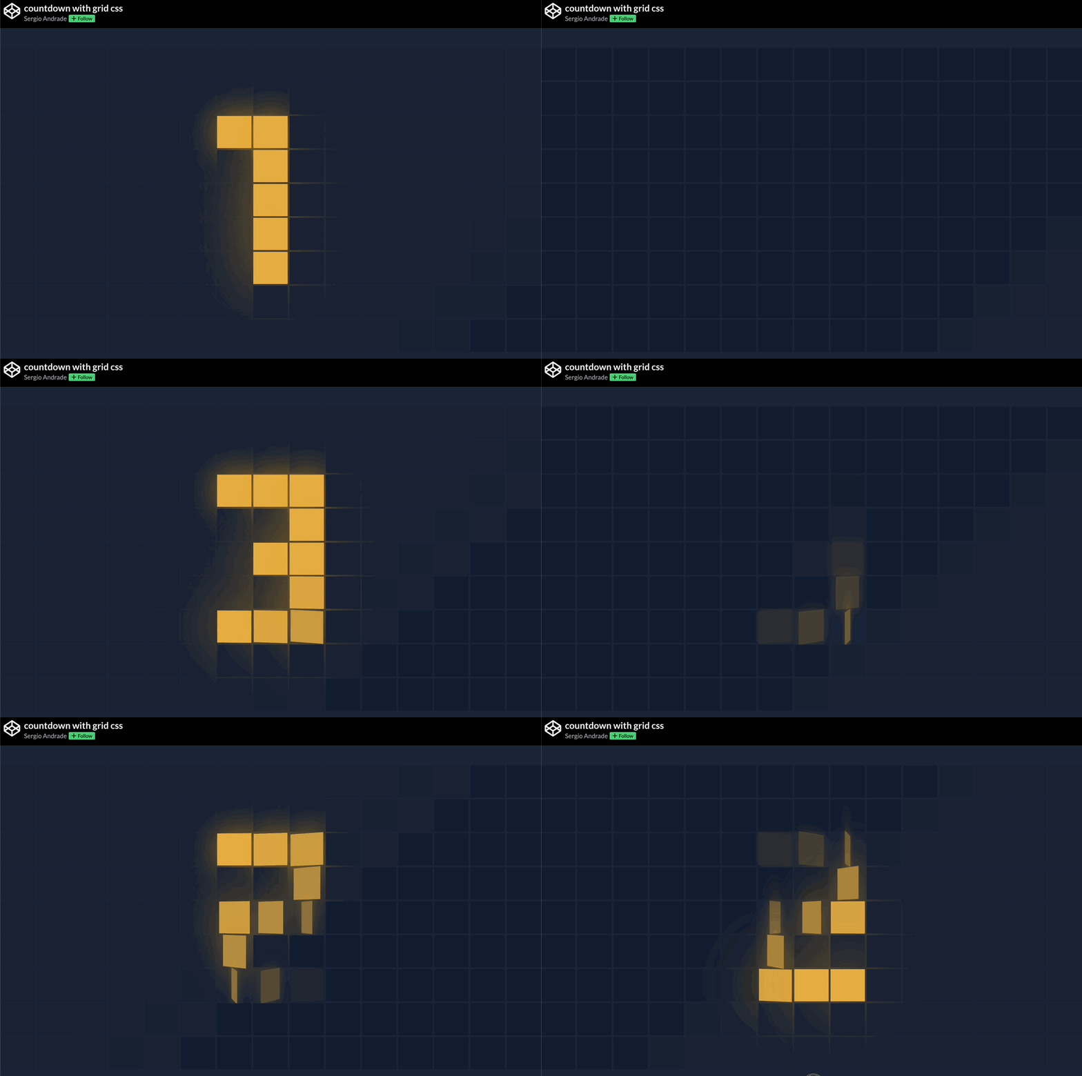

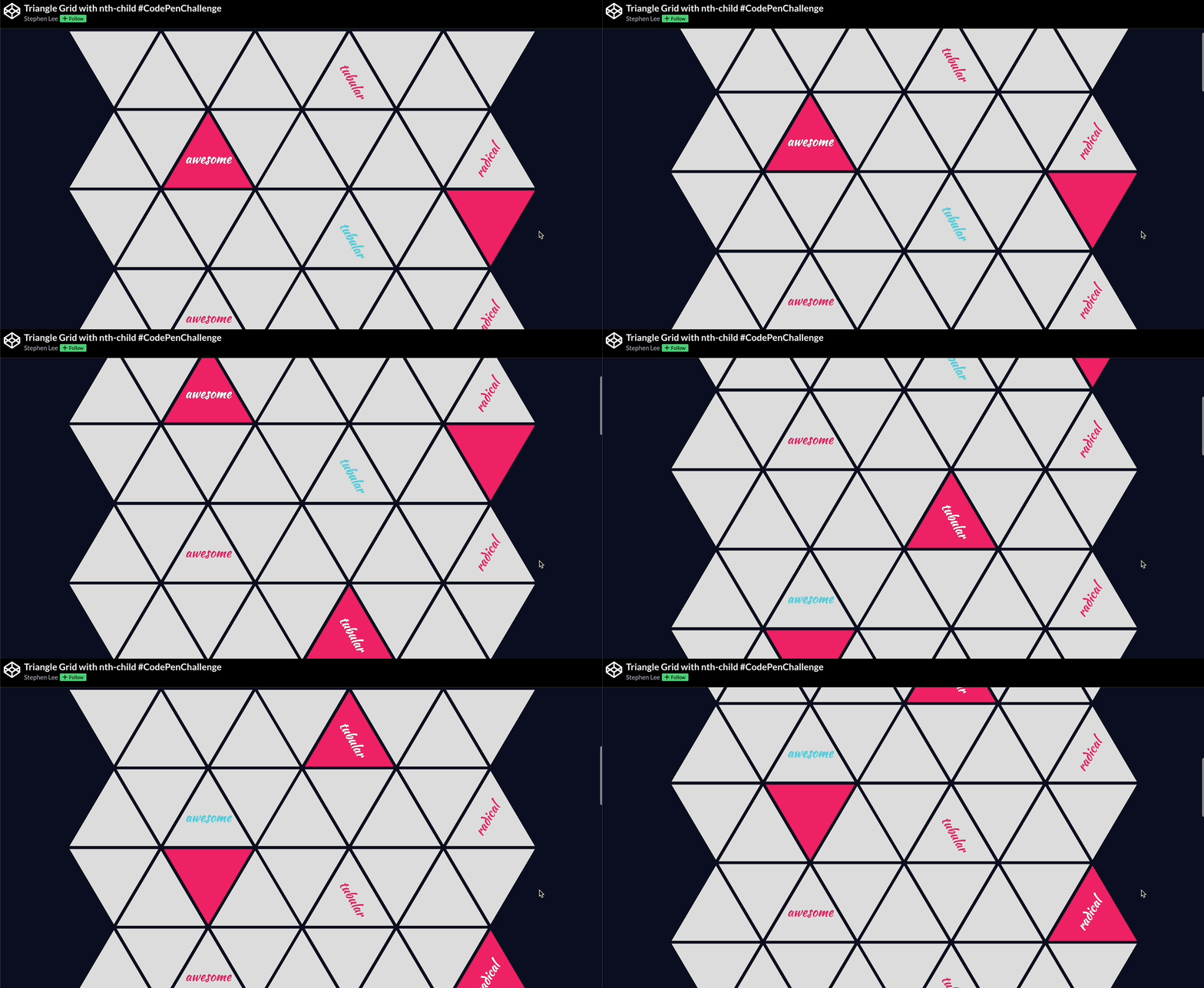
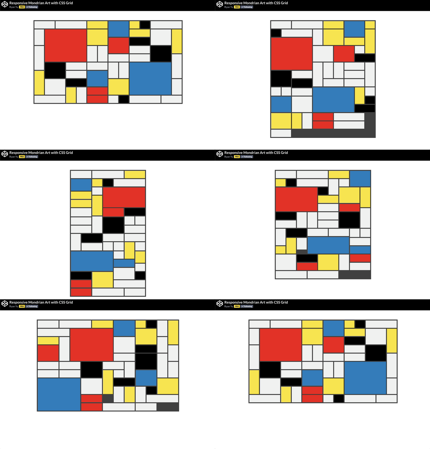
🙏 A huge thank you to all the creators and advocates who’ve shared these valuable resources. Your work continues to inspire and empower the community.